Logo design for DELLA B
Working on a logo project for an Indie Rock-soul band! Stay tuned and be sure to check the project page!

Logo design for DELLA B
Working on a logo project for an Indie Rock-soul band! Stay tuned and be sure to check the project page!

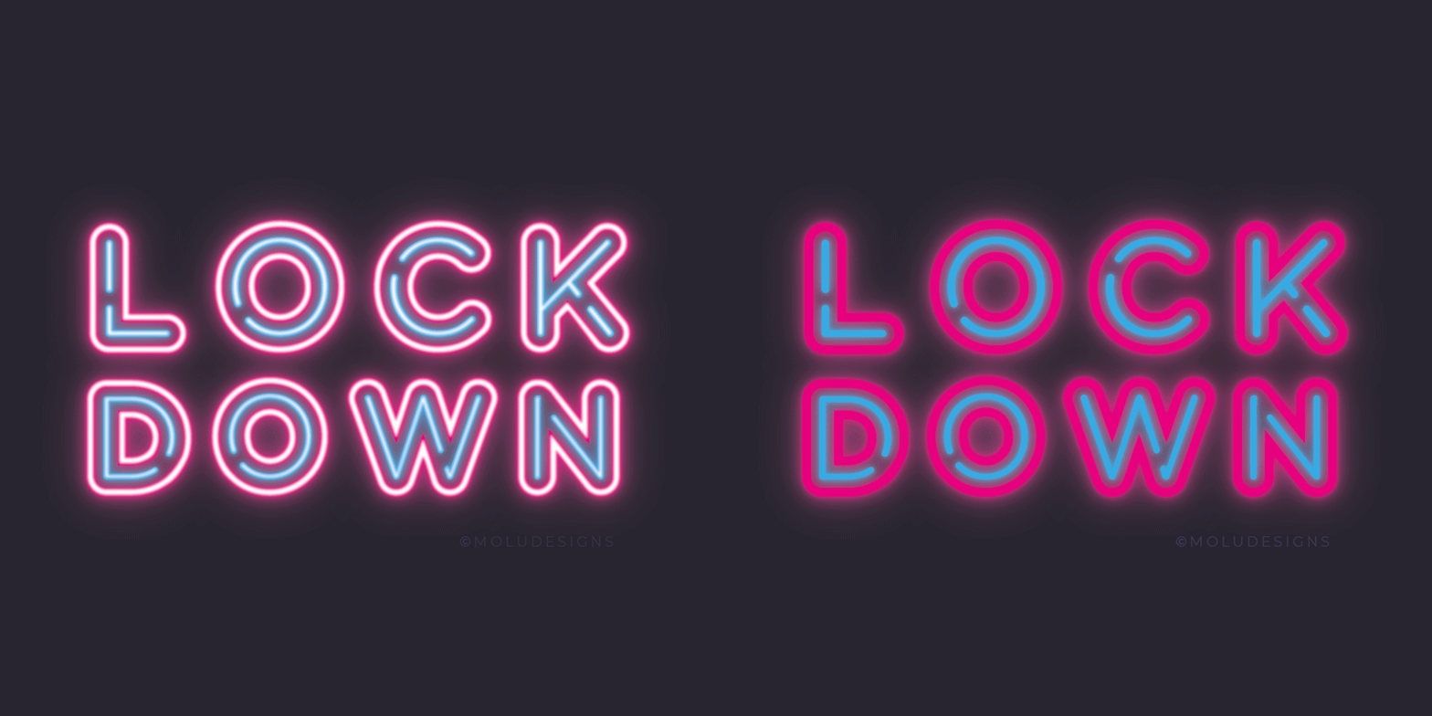
COVID LOCKDOWN TYPELOCKS
This year has taken us all by surprise with the COVID-19 pandemic, forcing many of us to work from home in the last couple of weeks. While it brings its own series of challenges with work being cancelled and postponed, it did also bring an opportunity to dabble in some self-initiated projects. The ones you usually didn’t have the time for in normal instances because you’re far too busy juggling a million jobs and trying to meet pressing deadlines.
So, I used this time to play around with some digital lettering, seeing as I didn’t have much access to my paints and sundries in my studio. I opted to create some fun isometric type locks using the current climate as the theme. If you follow me on social media, you’ll have seen these dotted on there to help get across the importance of these messages.

IMAGE CREDIT : Molu Designs
[All rights reserved ©MoluDesigns]

SIGNAGE WORK FOR MOMO KOMBUCHA
The MOMO Kombucha guys approached me to paint another signage this year, this time at the their New Covent Garden Market HQ. As before, they wanted their logo painted directly onto one of the doors which I was delighted to help with. Here’s some behind-the-scenes images of the work that took place.
There’s something about painting directly onto raw wood - i’m not sure if its the challenges it presents where you have no room for making mistakes, or simply down to its aesthetic qualities (or both??) but I do really get a kick out of it. Also love how it tied in nicely with their first market signage I did for them - see below - again, on raw plywood.
So if you or anyone you know that could do with some signage work, whether its freestanding, on the wall, market stalls or food trucks - you know where to find me!
MAGE CREDIT : Molu Designs
[All rights reserved ©MoluDesigns]

SIGNAGE FOR PICHI LONDON
Oh my gosh, I have been waiting to share this recent project I worked on for the awesome West London venue PICHI Cafe! I was asked to design and create a statement piece that would go on one of their interior walls, and the best bit…..I was given full reign to what I produce. Something fun, colourful, versatile and inspiring, was the brief! It’s not often you get that opportunity, so I was ran with it!
We opted for the phrase ‘Find A Way’ which is a favourite of mine as it is so open-ended that it can resonate to anyone in all kinds of manner, at the time they encounter it. So I created the type lock, one that I had roughly designed a while back but improvised on it to give it more depth and play, particularly as I was creating a layered cut-out 3D element. Instead of the design being one layer painted on a wooden panel, as you would typically for signs, I decided to cut around the letters and the drop shadows, even including another layer of cut-out letters on top.
Well, as you can see from the WIP images below, it was quite the labour-intensive piece but goodness I was completely in my element. This is what I love doing; marrying both my love for design and construction.
This project from inception to completion is a week’s worth of hard graft, to give you an idea of how something of this scale would take. It’s been such a pleasure creating this piece and grateful to Stef for giving me this opportunity to work with her on this.


My amazing friend Diana took some of these shots above which I’m grateful as I never have great behind-the-scene photos or of me at my work. What do you think then? I’m definitely eager to do more of these so if you’re interested let me know; whether its for your home, shop, venue or a pop up event, I’d love to be of service!
Hoping to get official photos taken of the piece in situ so I can update the project/work page. Keep your eye out for it!
IMAGE CREDIT : Molu Designs + Diana Stainton Photography
[All rights reserved ©MoluDesigns]

SIGNAGE FOR RENEGADE CRAFT
I was presented with another opportunity to create some bespoke signage for this year’s Renegade Craft fair held at the Old Truman Brewery. As I wasn’t able to work in-situ like the last time, it was decided that i’d create something in the studio in the weeks prior to the event so it was a matter of placing it on site easily by the RC crew.
The proposed idea entailed having some large cut-out wooden pieces; using the typeface and motifs from their brand, to create props to dress up the entrance window with. And in addition to this, a sandwich board / A-board for the pavement to help with navigation. Below are some images taken of the labour that went into this project.
The large scale letters and shapes were cut out of MDF wood and painted in the brand colours. The pieces all fit perfectly onto two 1220x2440mm sheets of MDF boards, which meant there were no unnecessary wastage. Templates were created for each element that were then used to draw out onto the boards. I then hand cut each piece using a jigsaw, sanded it down, primed it and then painted it in its final colours.
The project in its entirety, from start to finish, took 5 days in total; 2 for the design and construction of the A-board and 3days for the large scale wooden cut-outs.
Much to my frustration, I wasn’t able to photograph the final set up of the finished pieces but thanks to RC guys, I managed to get this shot they used on their Instagram account that shows the pieces on site just after it had been taken down from the entrance window area.

IMAGE CREDIT : Molu Designs
[All rights reserved ©MoluDesigns]

TWO BRAND IDENTITY PROJECTS

Had so much fun creating these logo/identity for indie businesses, Diana Stainton Photography and The Austrian Kitchen. I will be updating my portfolio with full details of this project so keep your eyes peeled in the New Year!!
IMAGE CREDIT : Molu Designs
[All rights reserved ©MoluDesigns]

AUTUMN WORKSHOPS
I had the pleasure of running a few of my “in-a-nutshell” lettering and sign-making workshops this autumn which turned out awesomely and had such a ball sharing some of my tricks of the trade to the attendees on creating hand-painted signs. Here’s some photos I took of everyone in action - I have to say i was completely impressed with their eye for colours and painting skills!
Workshops are usually limited to 8 people so that you get my undivided attention. Once in a blue moon I tend to hold these workshops outside my East London studio such as the one held in New Craft House, but most of the time, you’re in the comforts of my laid back space.
It’s a great way to try your hand at something new - it’s open to all abilities by the way - be it a little therapeutic treat or if you’re actually looking to learn a new skill. They do also make great group events and gifts for special occasions. Either way, it’s always a great pleasure meeting different people and imparting my knowledge with you. The purpose of these in-a-nutshell workshops is so that you feel you can create some cool signs without having to be a fully-fletched letterer or sign-writer.
So yea, would these be of interest to you?
So if you’d like to join in on the lettering antics, book now before they fill up real soon! Oh and if you’d like to buy it as a gift for someone, let me know and i can generate a gift voucher for you to present them with!
IMAGE CREDIT : Molu Designs
[All rights reserved ©MoluDesigns]

FOR THE LOVE OF BEVEL
Who doesn’t love a bit of bevelled type? Well I sure do and when I don’t get enough client work that involves this typeface, I just go right ahead and create random signs simply to get an excuse to paint it!
I had actually created this ‘Namaste Bitches’ as a template for my lettering workshops so decided to paint it using one of my favourite colour palettes onto raw plywood that i had kicking around. Here’s a few behind-the-scenes photos of the piece.
![IMAGE CREDIT : Molu Designs [All rights reserved ©MoluDesigns]](https://images.squarespace-cdn.com/content/v1/5492e437e4b0f844eaef98ab/1541191789962-OT9TXYEGGOL07WUISE9E/Alwayshandpaint+-63.jpg)
IMAGE CREDIT : Molu Designs
[All rights reserved ©MoluDesigns]