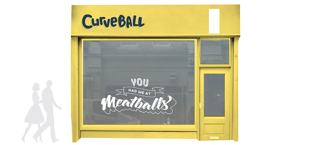
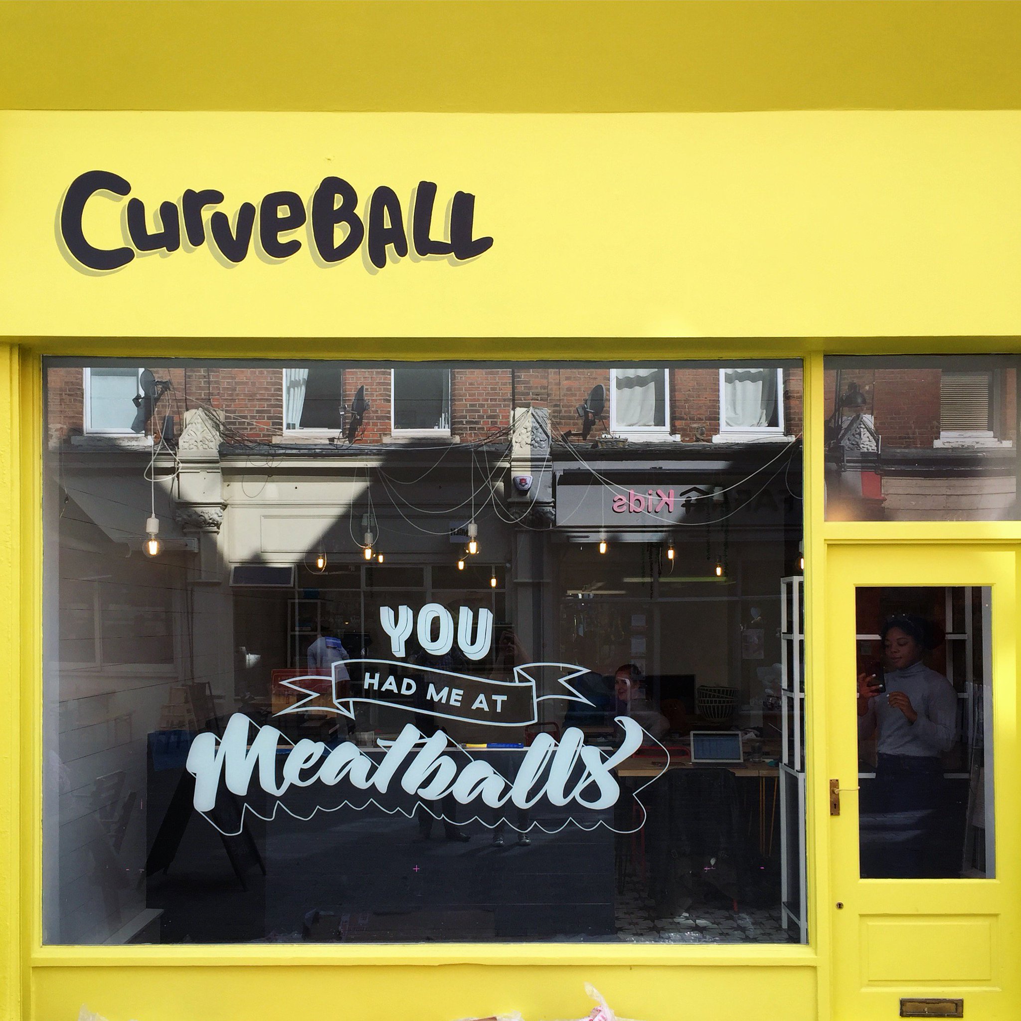
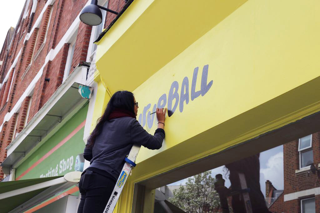
Another favourite from earlier this year (and yes, another yellow one!!) a shopfront project I worked on this Spring for a hip, new, pop-up meatball joint called CURVEBALL opening up in Balham. I was commissioned to paint their logo as well as design and paint playful window graphics that would grab people's attention and lure them in, particularly in the the run up to their big launch.
The premises is located on a busy pedestrianised street just off Balham high street, surrounded by numerous shops and well known eateries so it was imperative that the new spot "stood out from the crowd", so to speak.
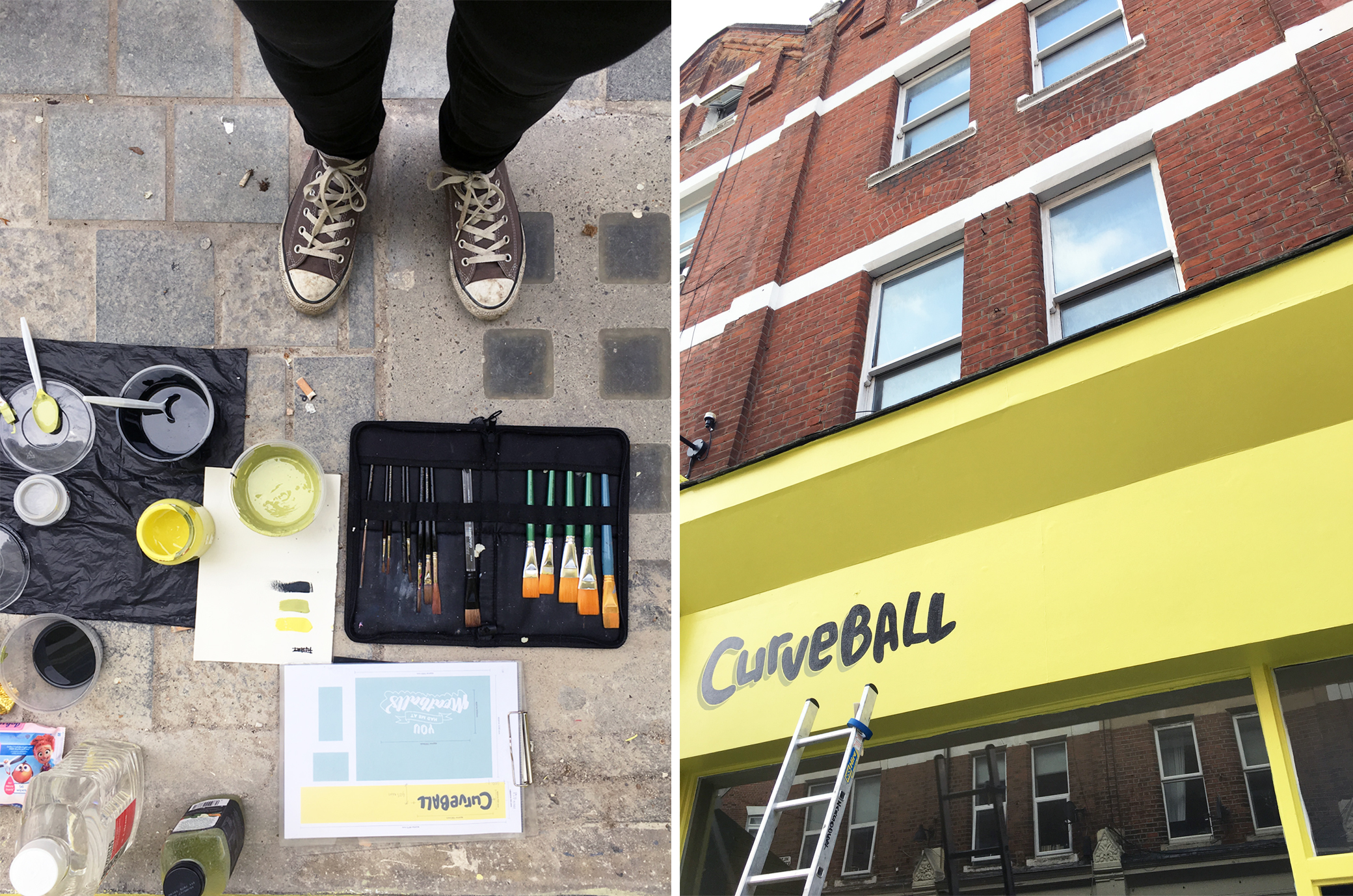
So after a series of discussions on the overall aesthetics of the restaurant, it was decided that the first move to achieve a frontage that popped out from all the distractions on that street, and stay in keeping to the brand, was to paint it a fresh, zingy colour a.k.a. 'Yellowcake' by F&B. The logo I then painted was done in a dark charcoal grey/black colour, with a subtle drop shadow, in order to maximise legibility from all points on that busy street.
Simple yet effective.
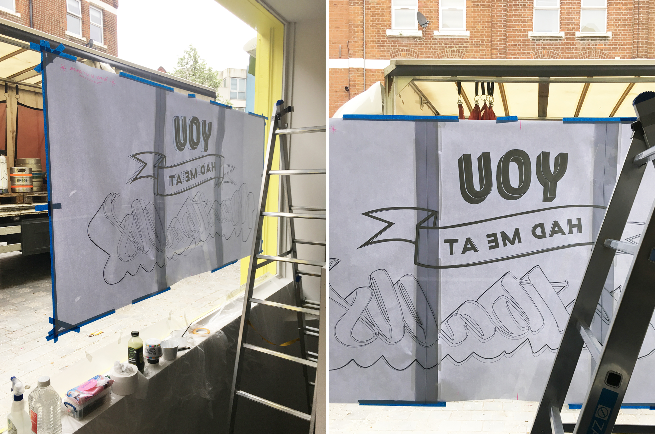
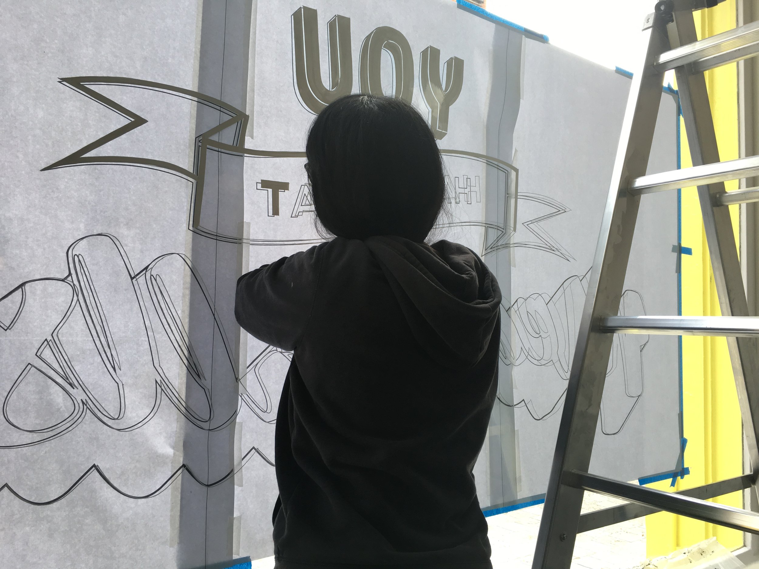
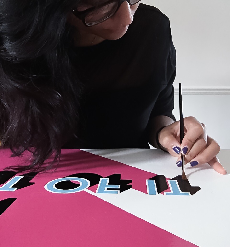
The second approach was the hand lettered element for the large picture window, that I wanted to be both fun and of course, Instgram-worthy! The "You had me at Meatballs" graphic was a playful take on the popularised catchphrase from Jerry Maguire to give passer-bys something to stop and engage with, in the hope that it leaves them wanting to know more about what goes on behind those glass panes. And most importantly, the underlying message being that it doesn't take much for us to fall for the humble meatball! (I mean who wouldn't!?)
As for the design - I wanted this piece to explore free-hand lettering styles and compositions so that reflected both the playfulness and craftsmanship that you would find behind all the globally-inspired dishes and drinks that would be served at the restaurant.
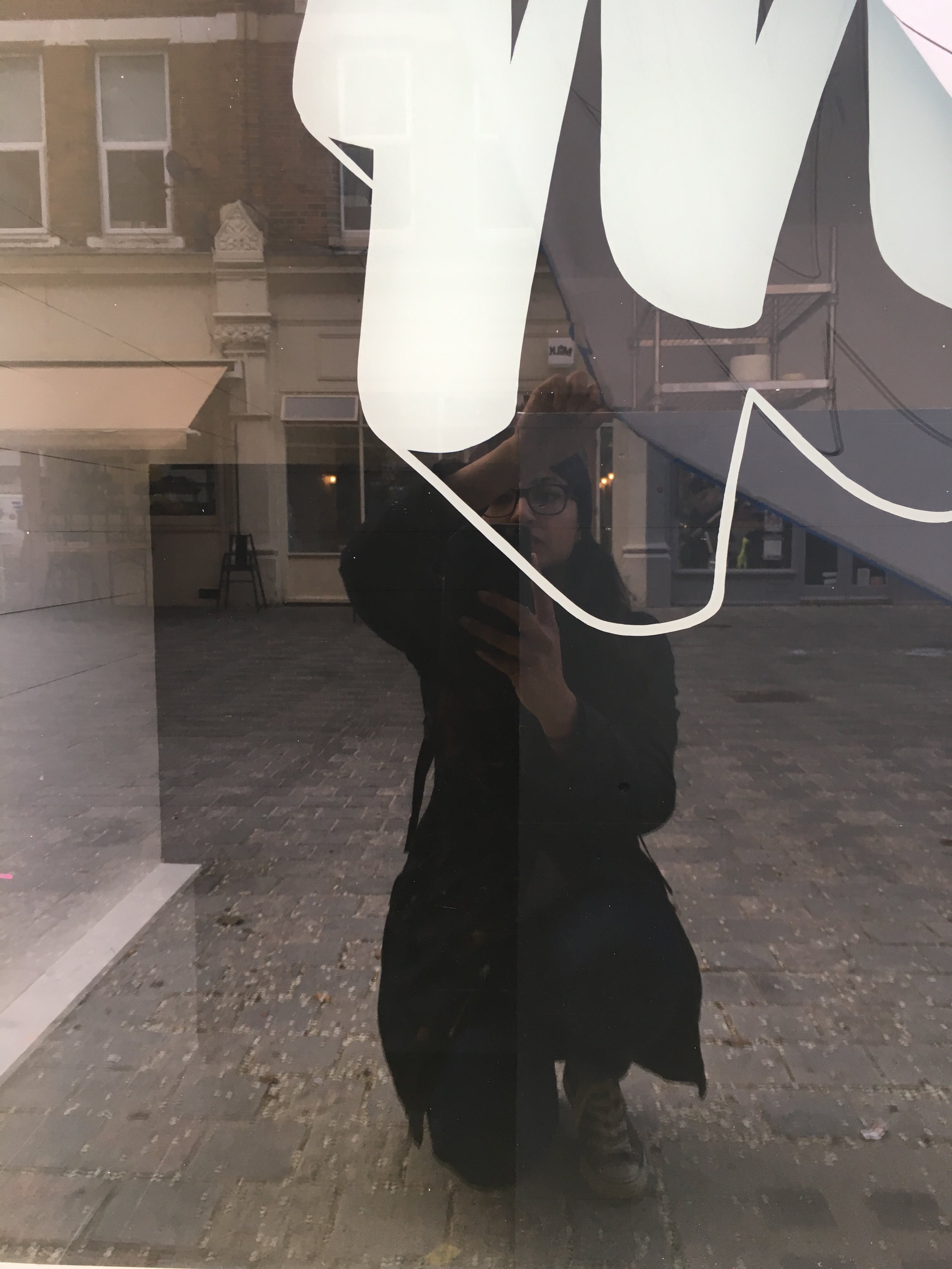
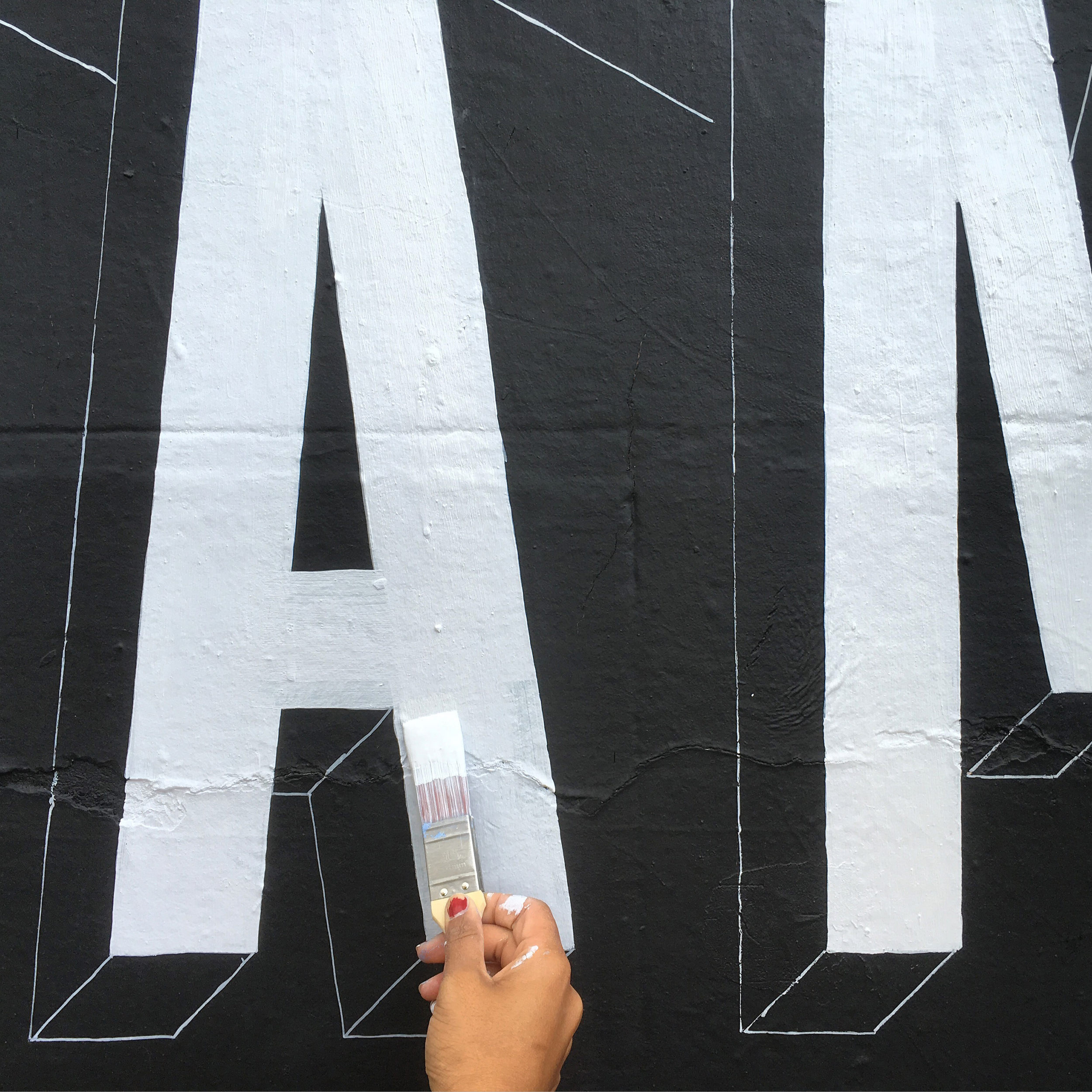
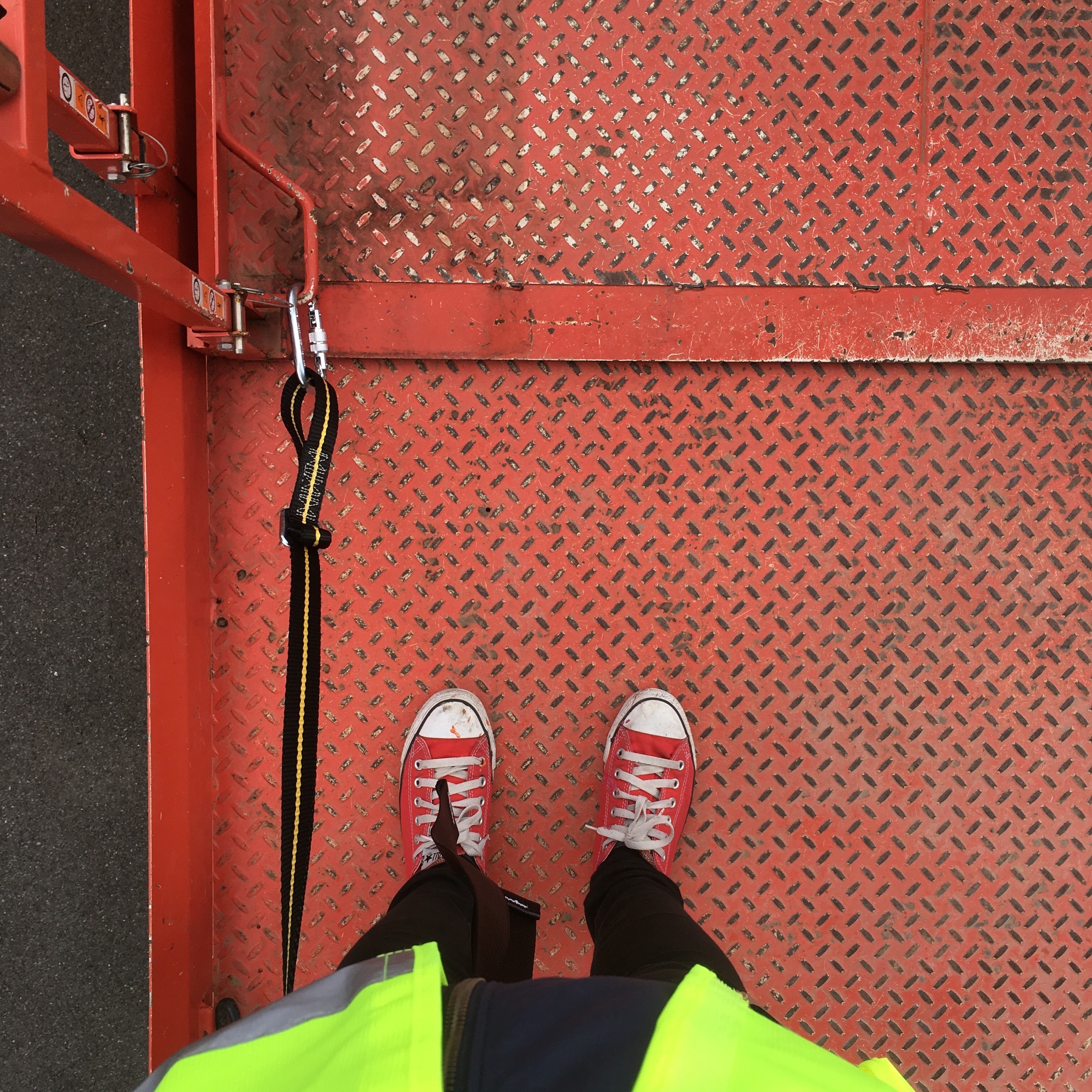
The whole job took 5days: 2days to finalise the design and 3 days to complete on site which includes all the setting up, drawing out and painting. The window graphics that spanned 2m in width, was probably the trickiest to do having had a steep and tight staircase to work from inside and decorators to work around too, but I have to say it made the job all the more satisfying seeing the finished article at the end.
Final/official images will be coming soon to the 'Portfolio' section but in the meantime, here's a peek of how it looked a week after it's reveal. Oh and you should totally stalk their Instagram account - but be warned, it will leave you salivating... or worse, licking your screen!
IMAGE CREDIT : Molu Designs / Hannah Pemberton
[All rights reserved ©MoluDesigns]
