FIG ROW STUDIO ENTRANCE SIGNAGE
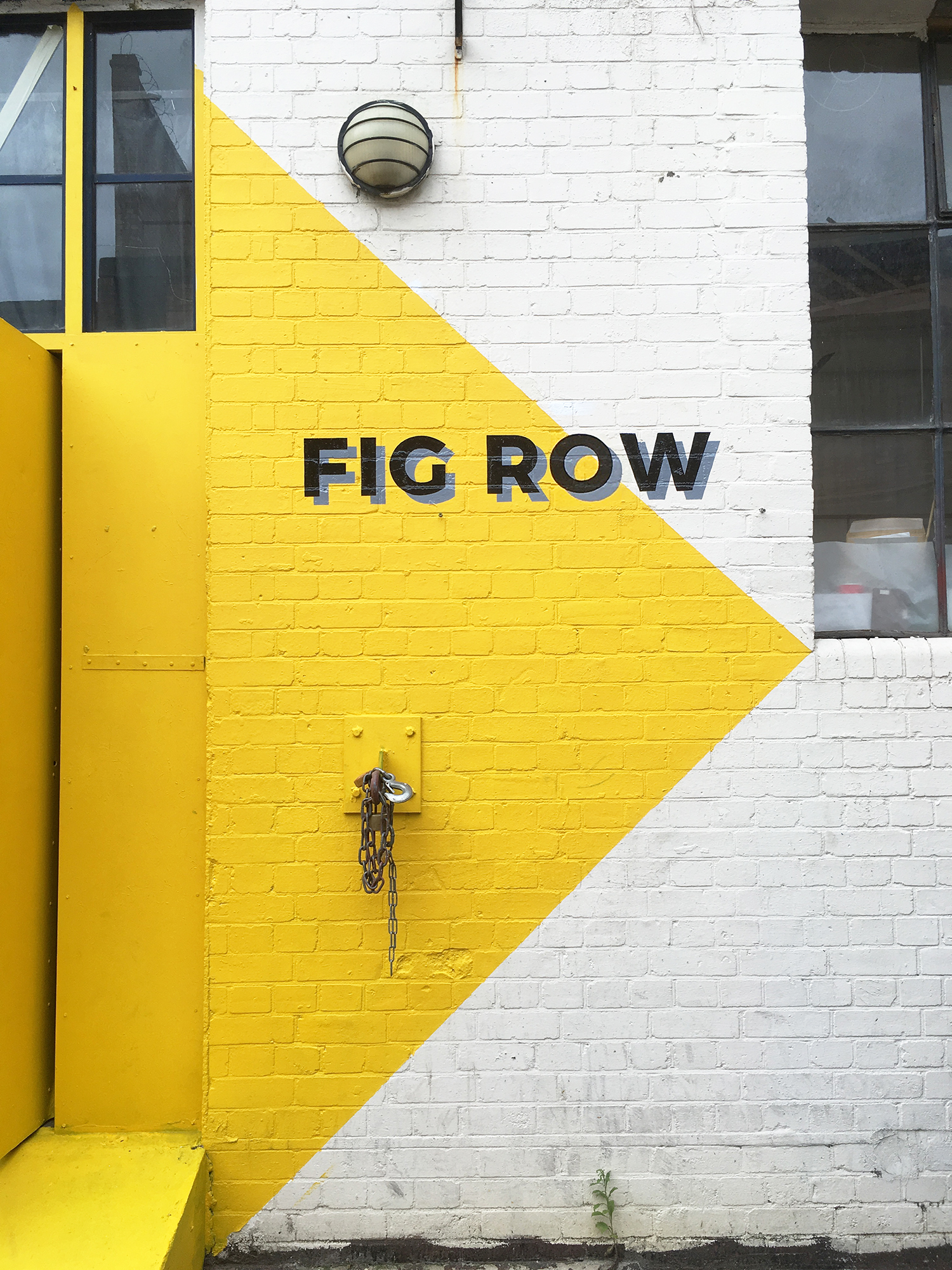
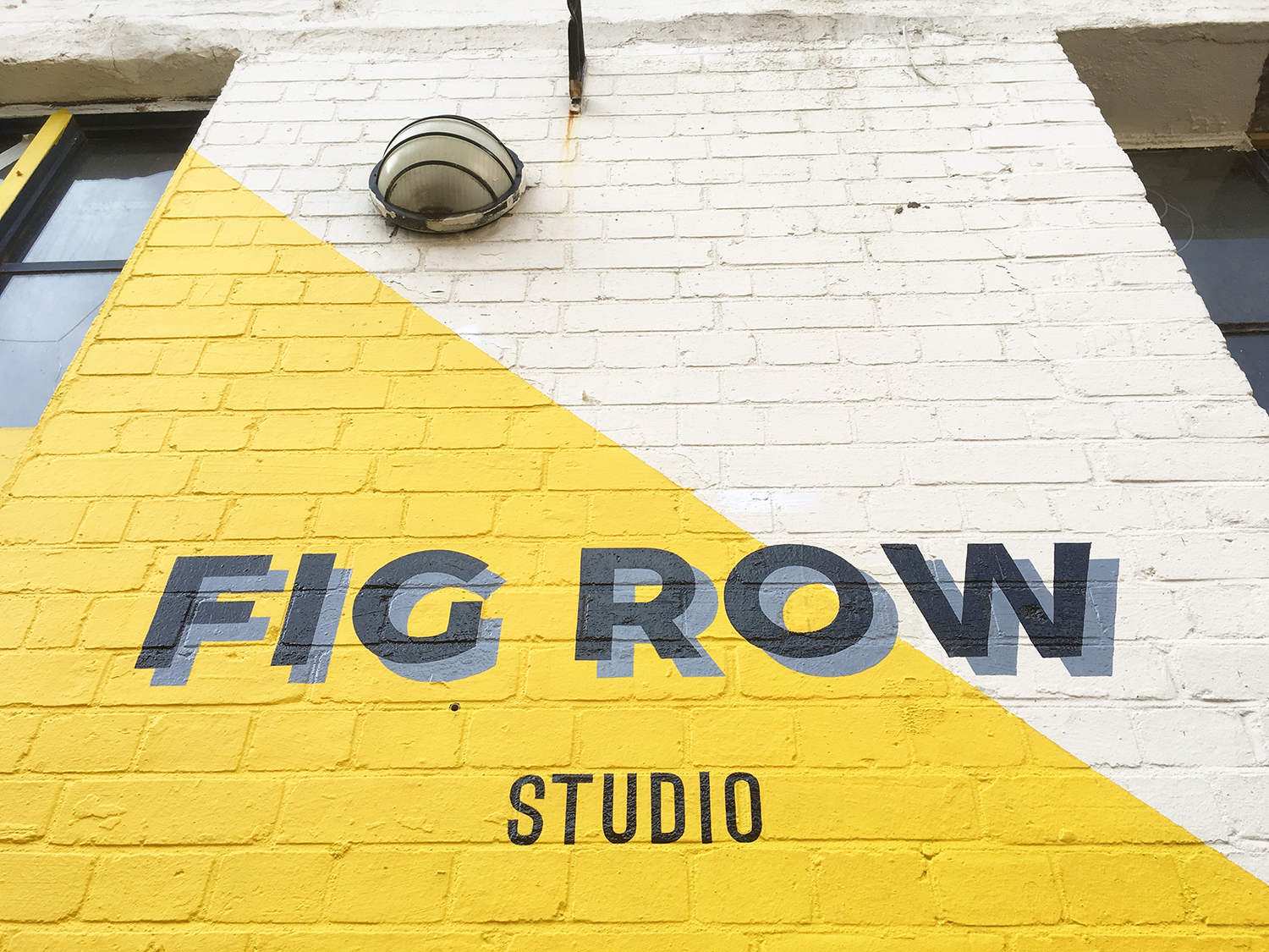
Last week, I worked on an entrance signage for the studio in Limehouse. The rather weathered frontage had been aching for a lease of life so I proposed the idea of creating a bold, bright and statement entrance using a yellow, black and grey as the primary colour palette.
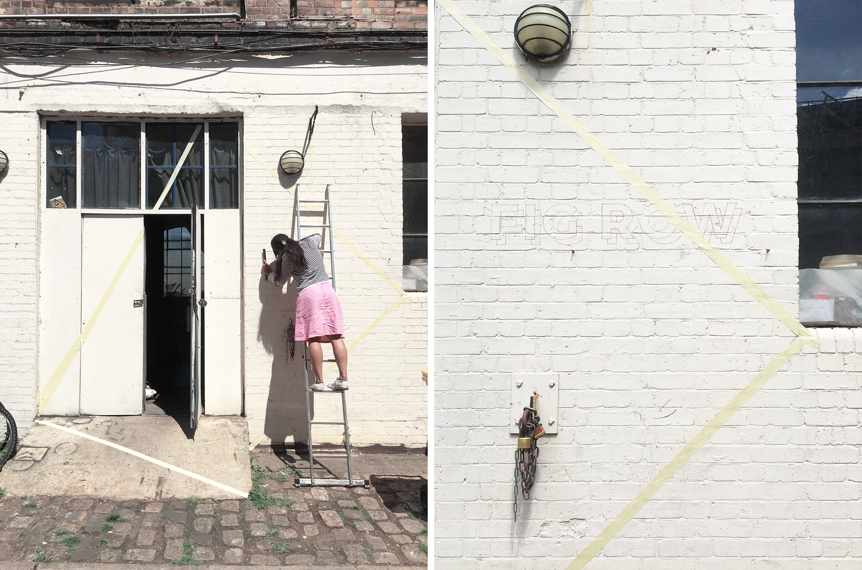
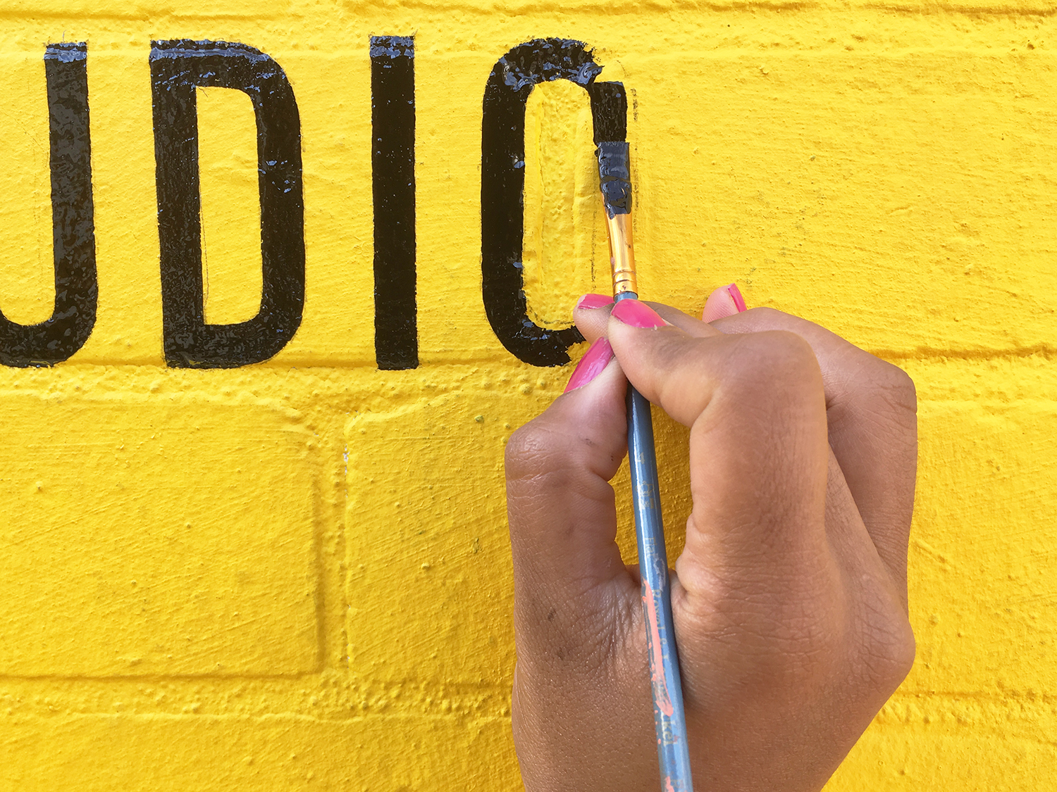
The design was kept relatively simple with the entranceway as the focal point. Taking key points around the doorway, I mapped out a bold geometric shape which I then blocked out in bright yellow masonry; from the walls and doors to the concrete floor. I kept the typeface for the studio name clean and minimal, which I hand-painted in black and included a grey drop shadow to give it an even stronger and punchier look.
I absolutely loved working on this project for it's scale and overall simplicity which worked out a lot more effectively in the end. The yellow totally makes it! All in all, it took 3.5days for the entire job (from initial design sketches to production) and was lucky enough to have good weather for it too!
I will be taking more professional shots to add to my portfolio section, but in the meantime, here are a few behind-the-scenes images of me at work!
IMAGE CREDIT : Molu Designs
IMAGE CREDIT : Molu Designs
