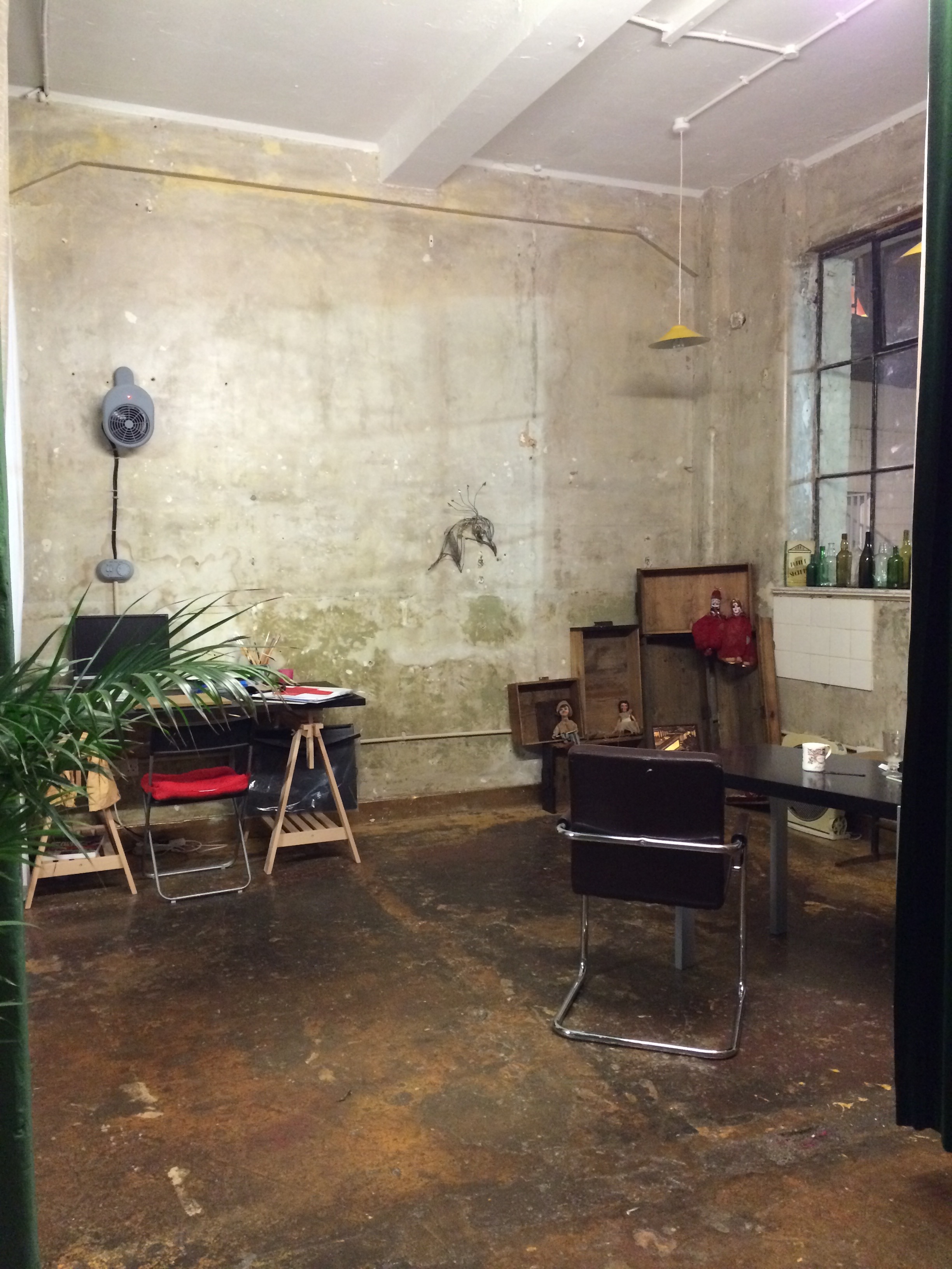
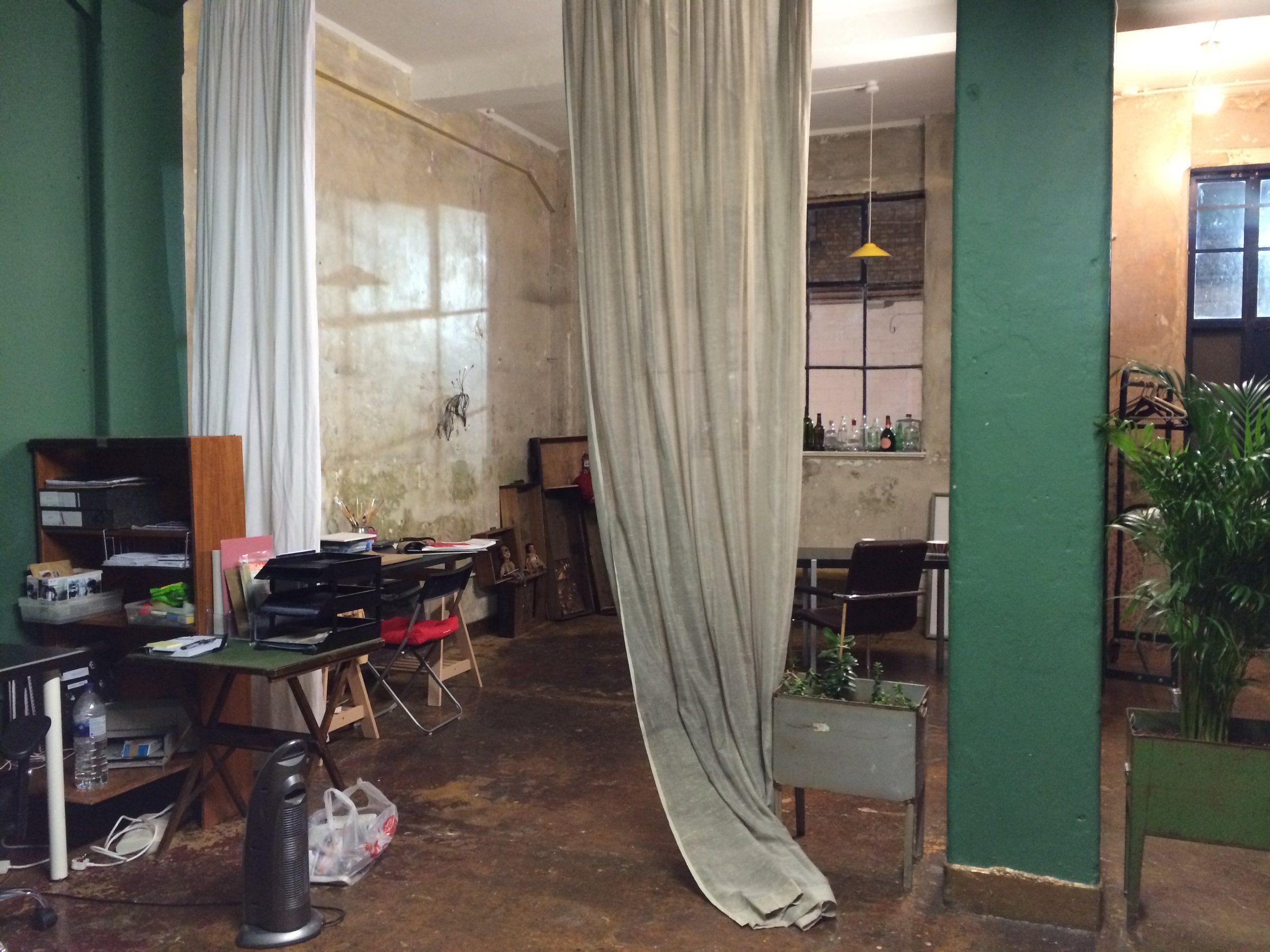
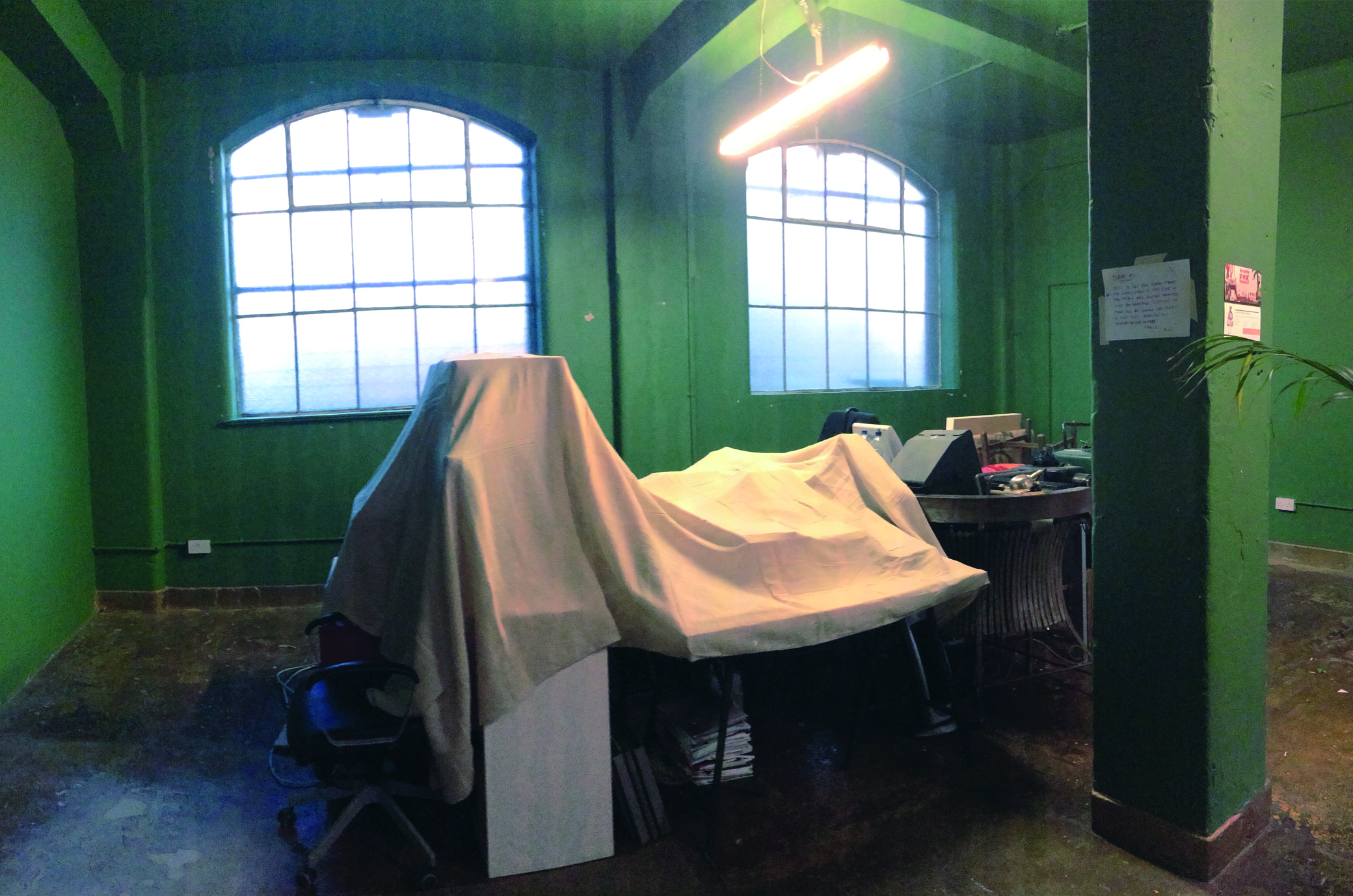
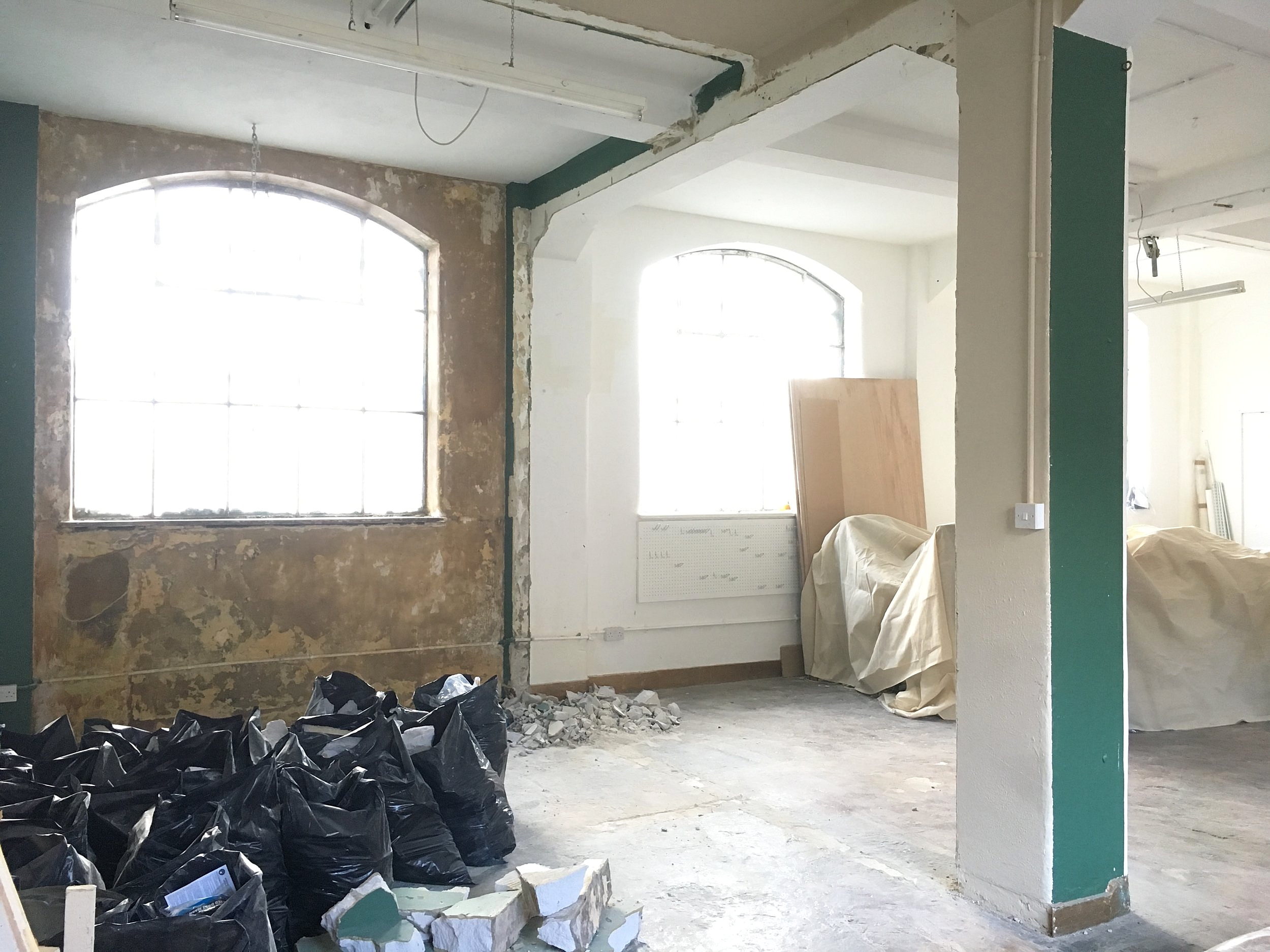
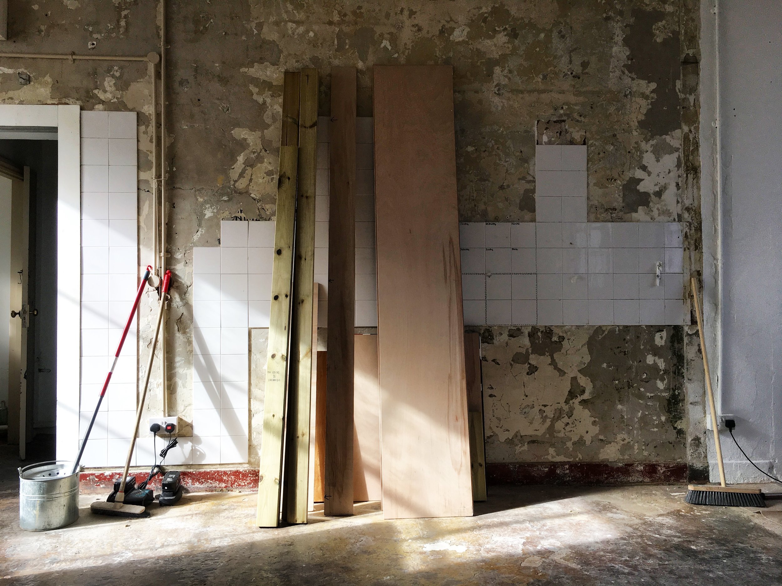
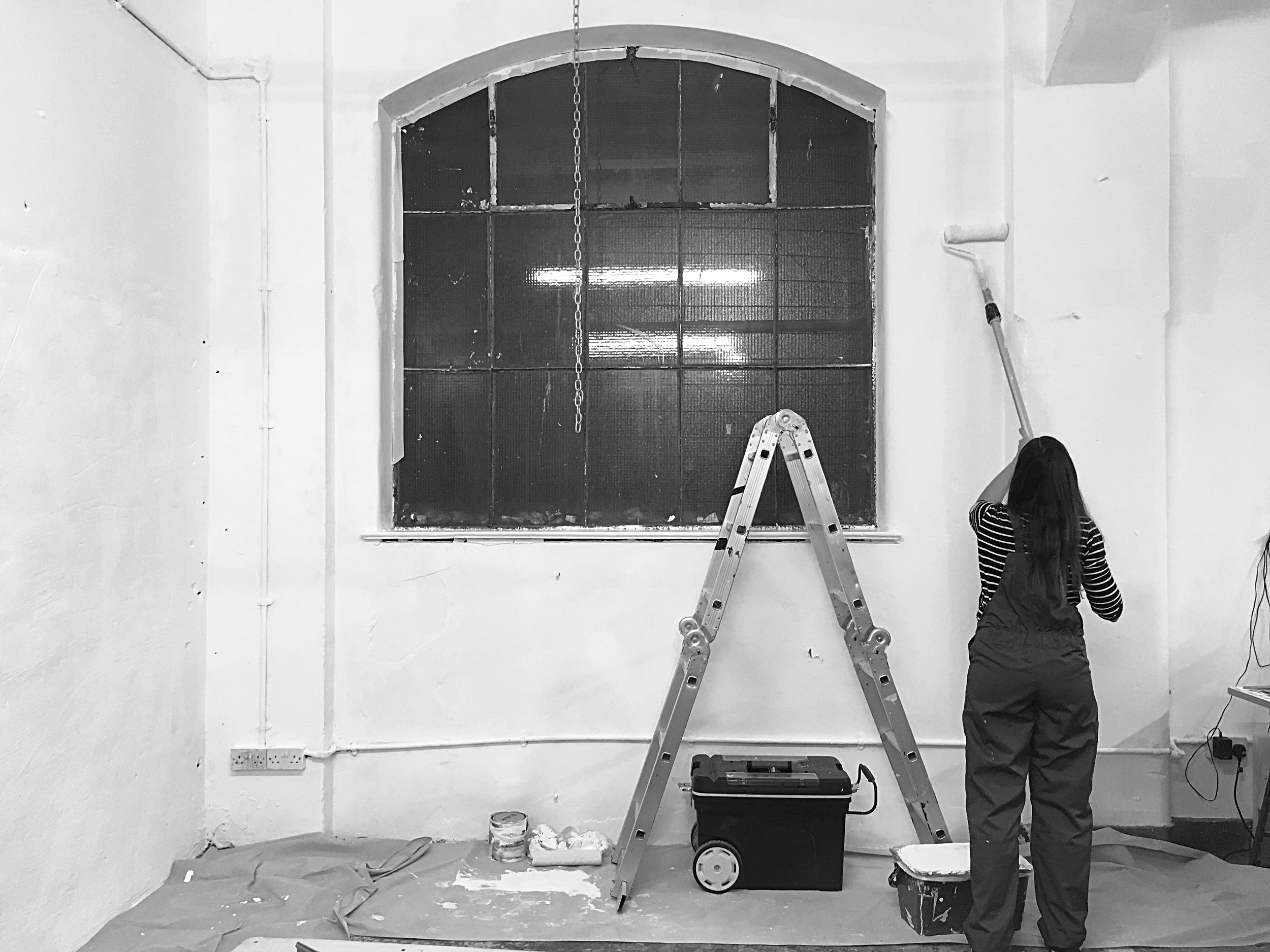
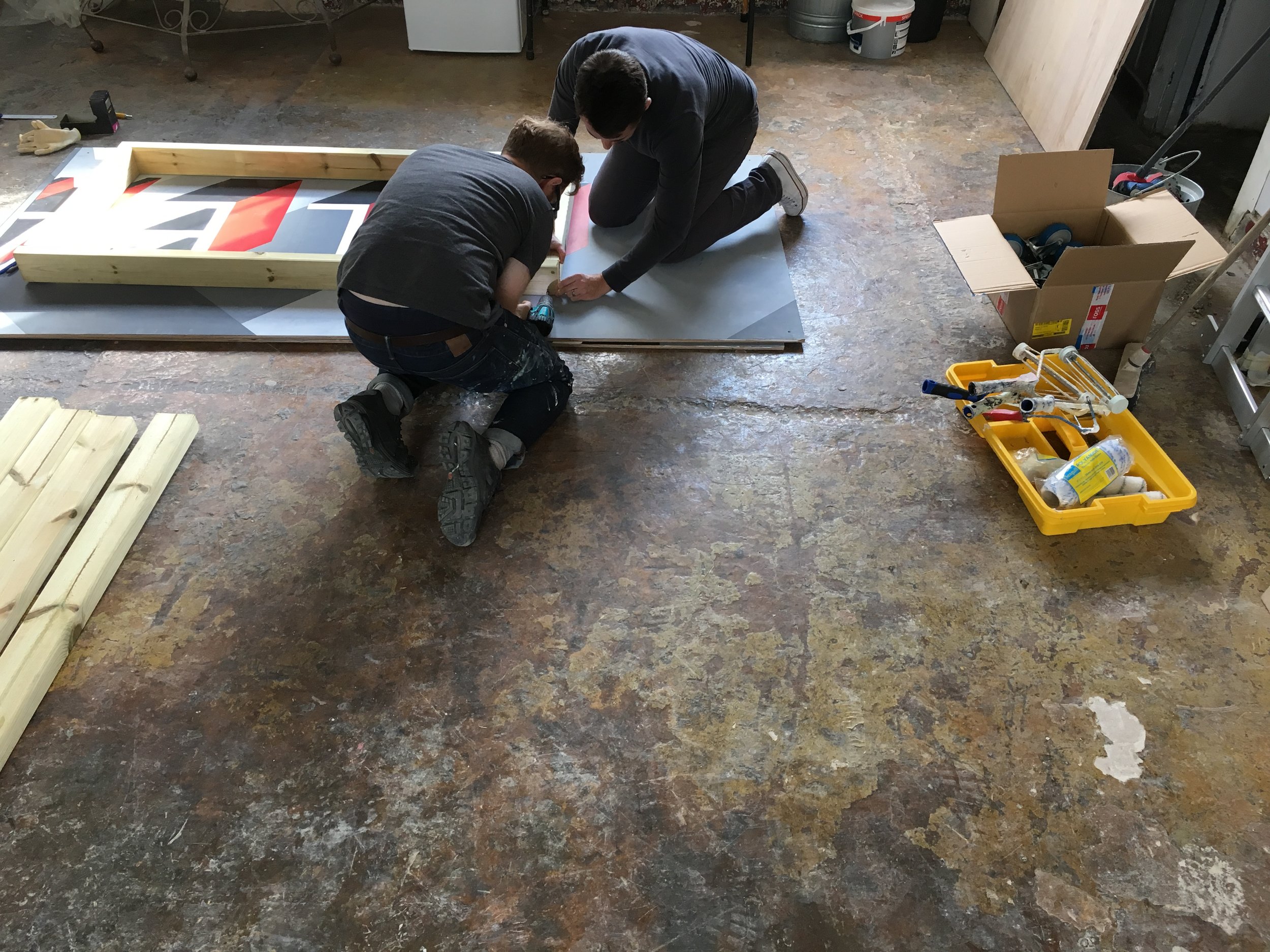
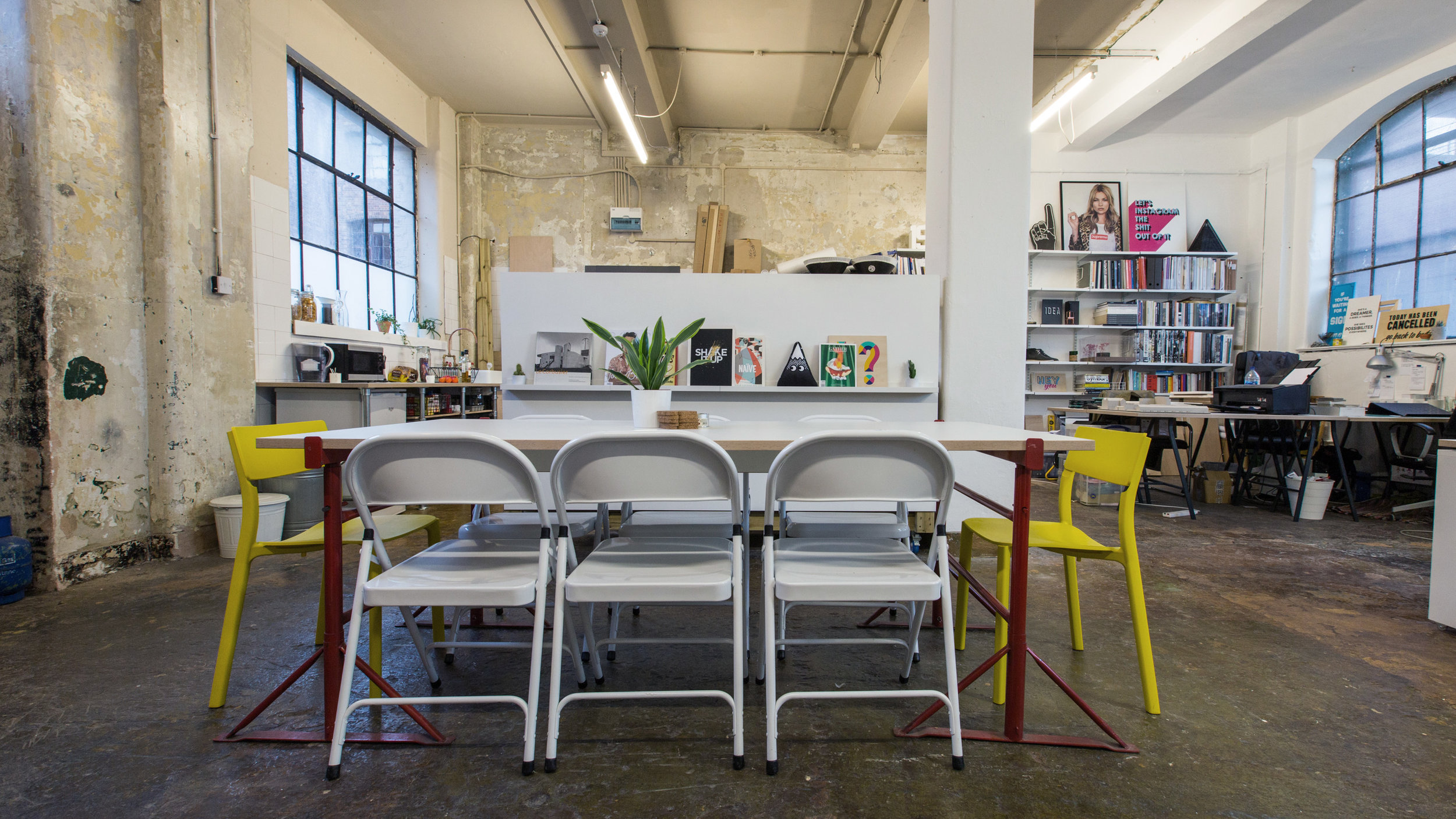
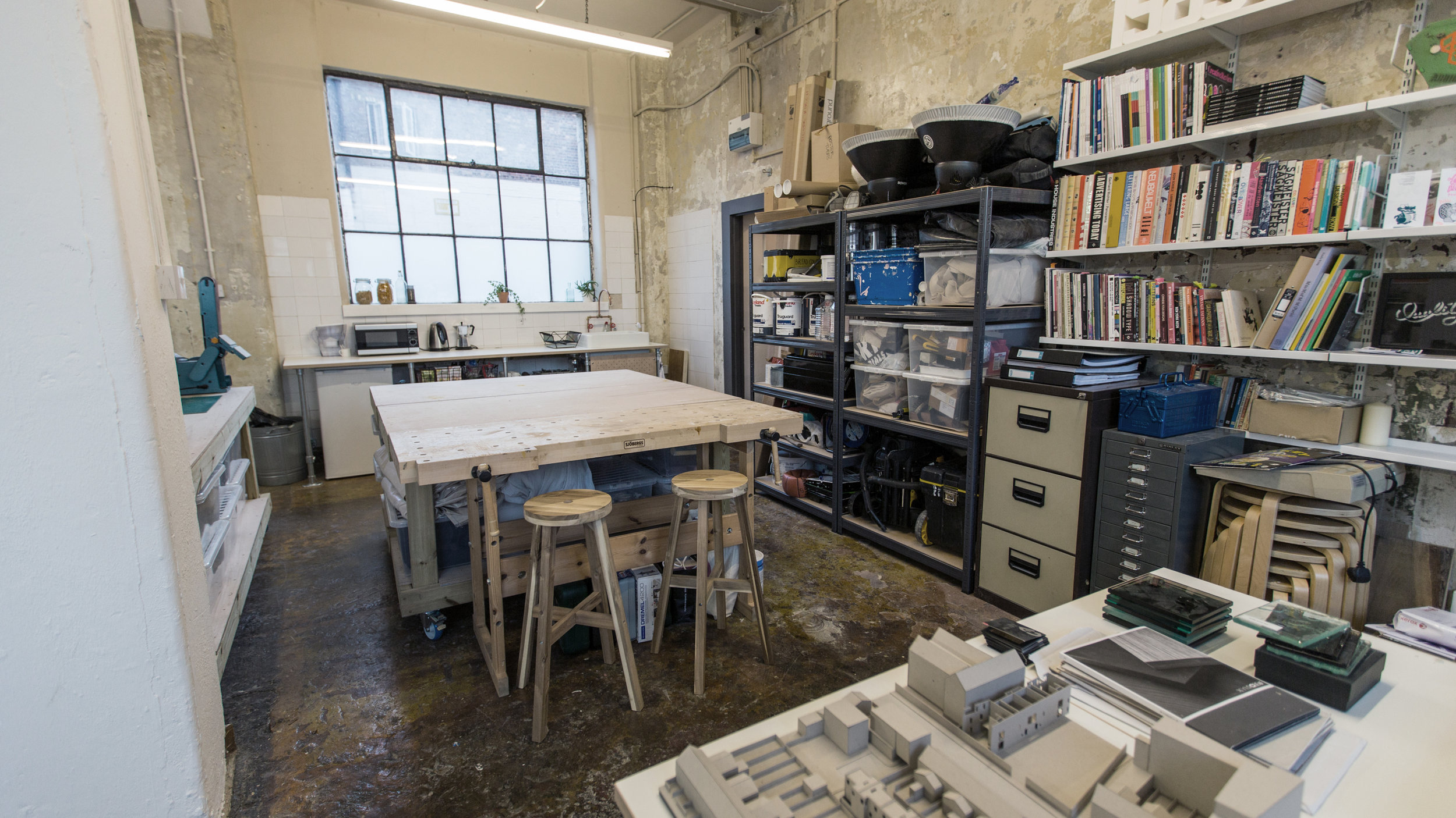
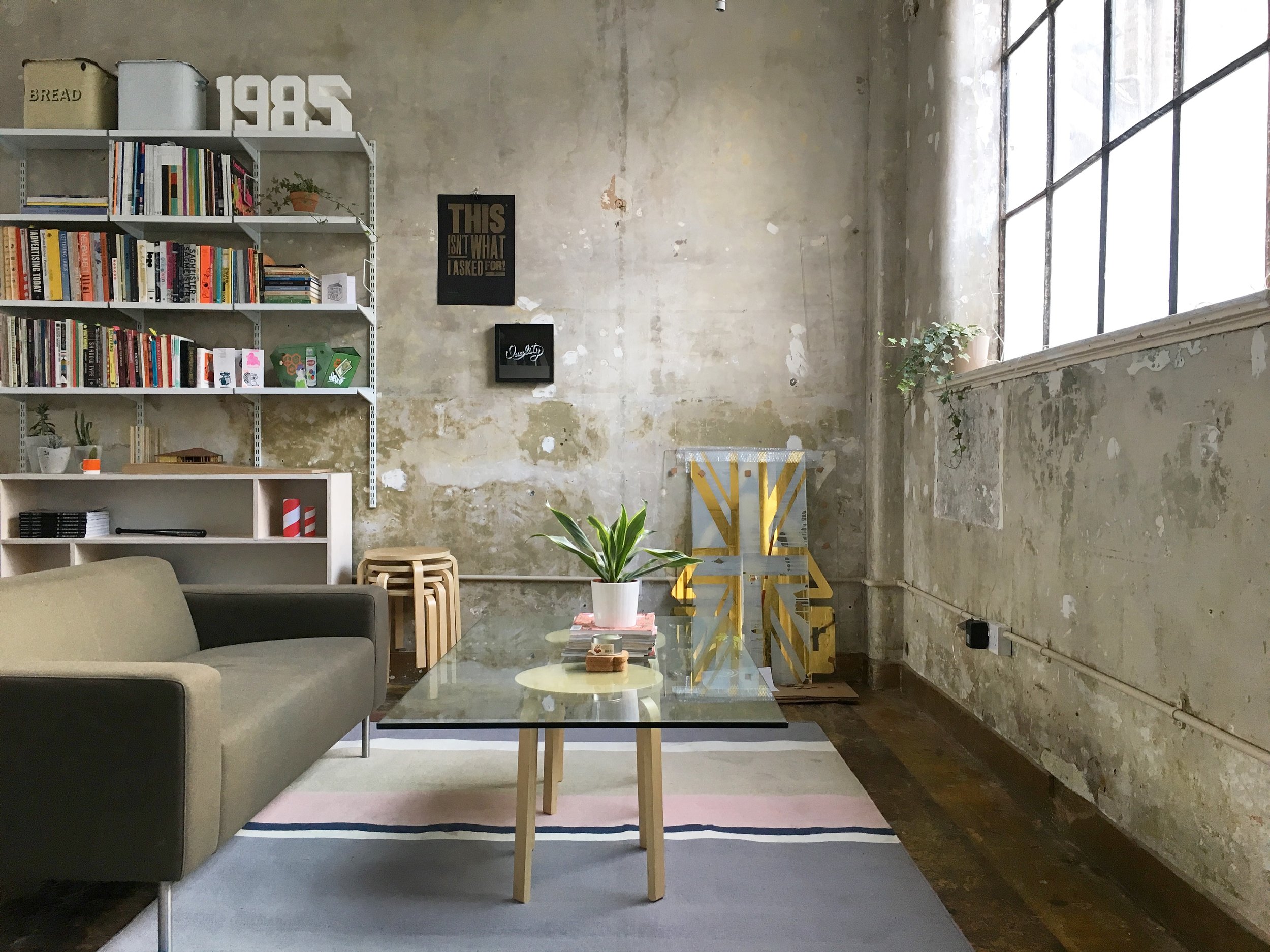
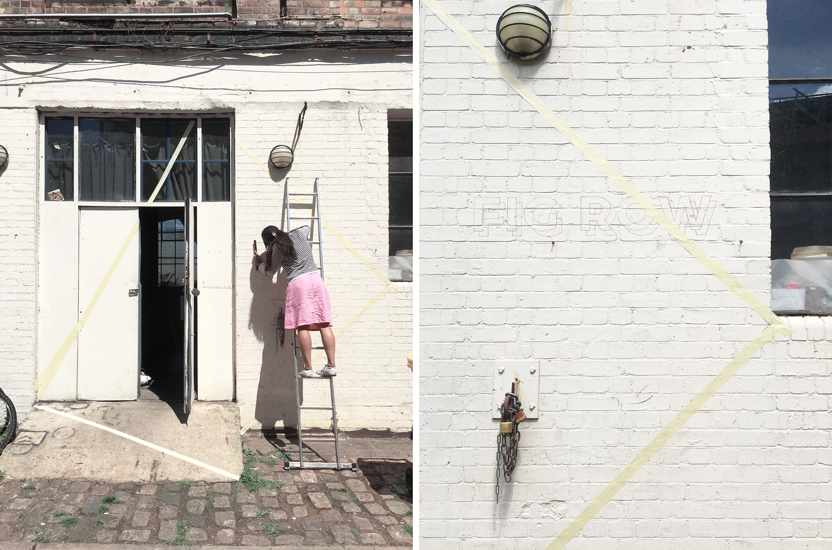
We've had some exciting changes take place within our studio early this year that has brought an entirely new look and vibe to the space, so I thought I'd share a few images of all the major changes the space has seen since we first moved in 2.5years ago!
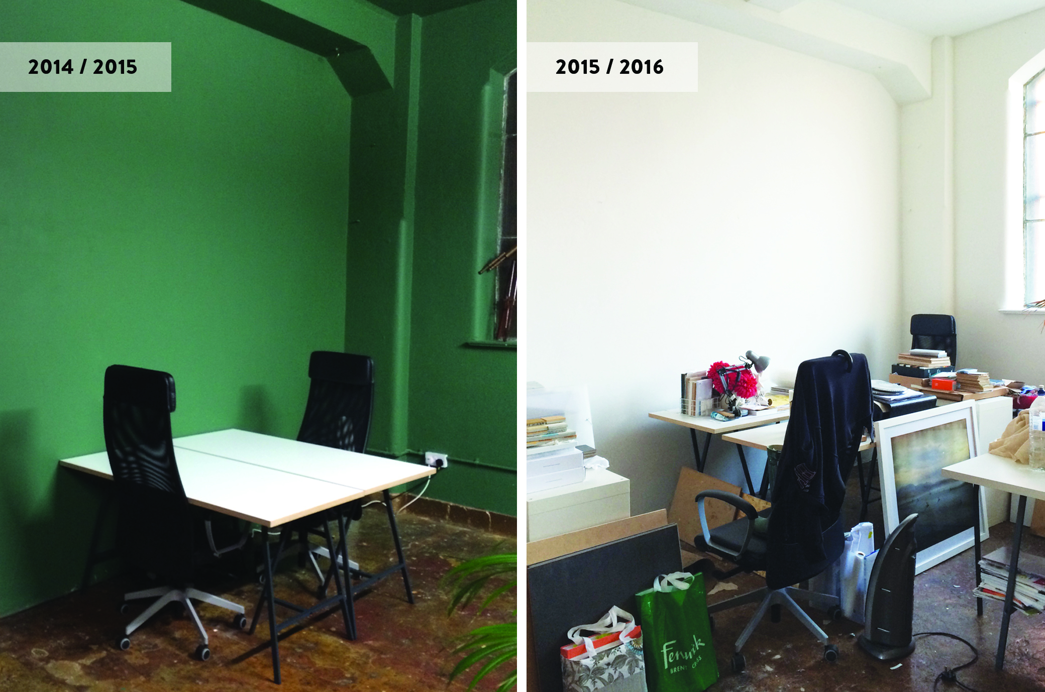
Before it turned into a co-working shared space, the unit had been leased out for photoshoots, film showcases etc so when we first moved in winter of 2014, the large Victorian unit, with all it's lofty, industrial, warehouse charm, had a more atmospheric and somewhat theatrical vibe to it. It wasn't your typical slick industrial studio space that you'd find all across in East London but one with deep rooted character and history. One half of the studio had exposed walls that revealed so many layers of textures. The other half was painted in a deep green that I must say, made you feel like you were part of this really cool Wes Anderson film set!.
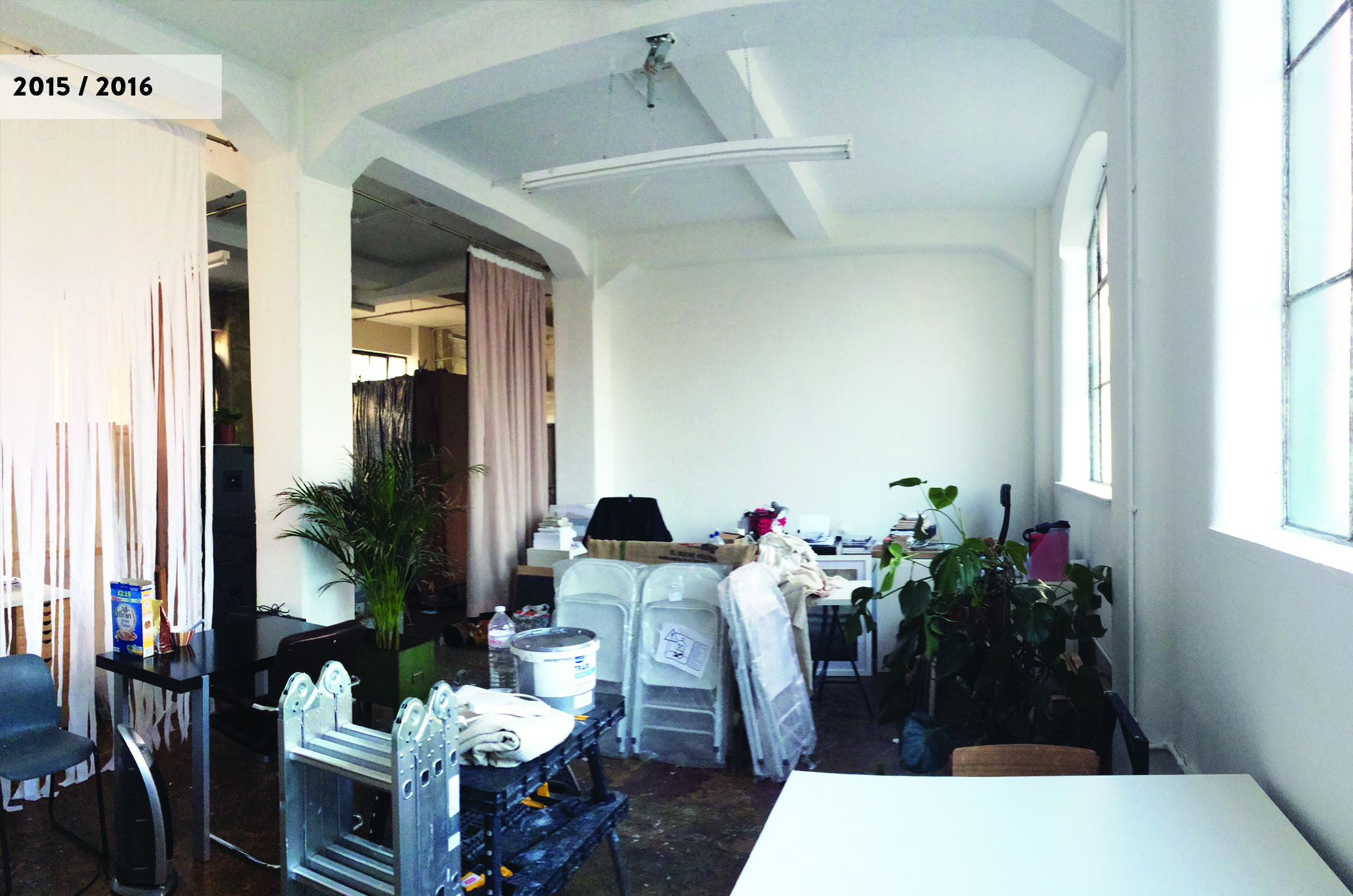
Anyway, over the next year and a half, the studio quickly filled up with creatives and workspaces were personalised to suit each of our work and personal styles. The layout, as a result, kept changing constantly to accommodate everyone. Communal areas eventually became non-existent, and the studio ended up becoming, what was in effect, several pockets of individualised spaces within a large space. And with more folk moving in and out over the year, the studio gradually lost all the charm, the lofty open-plan space, once had. As for the overall aesthetics - what was once spacious and unique soon looked sombre and cluttered.
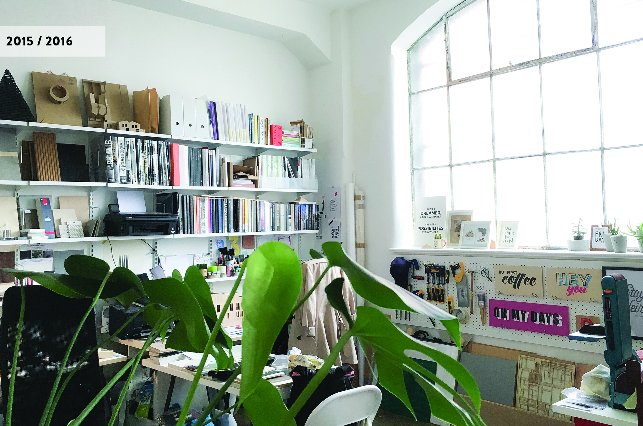
Thankfully last autumn, an opportunity arose for a change, and collectively a bunch of us decided to revamp the entire space by opening up the floorpan further (back to it's original layout) to create more defined and functional work areas and dedicated communal spaces such as workshop, meeting and lounge areas. For most of us, being freelancers and small businesses, the studio basically acts as a second home with many hours (far too many at times!) spent working in it so it was imperative to create a healthier and inspiring work environment where we weren't just sat at our desks 24/7! This meant having a fully functioning kitchen area for our meals and coffee/tea breaks, workshop area to accommodate labour-intensive work like model making and sign-painting, and break out spaces to retreat to.
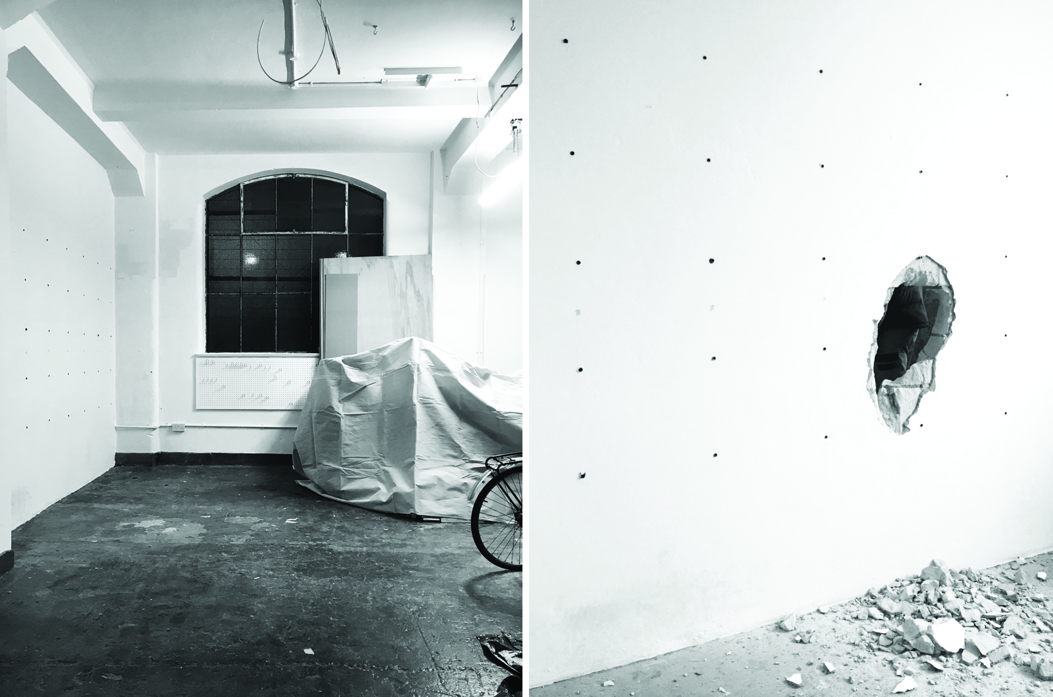
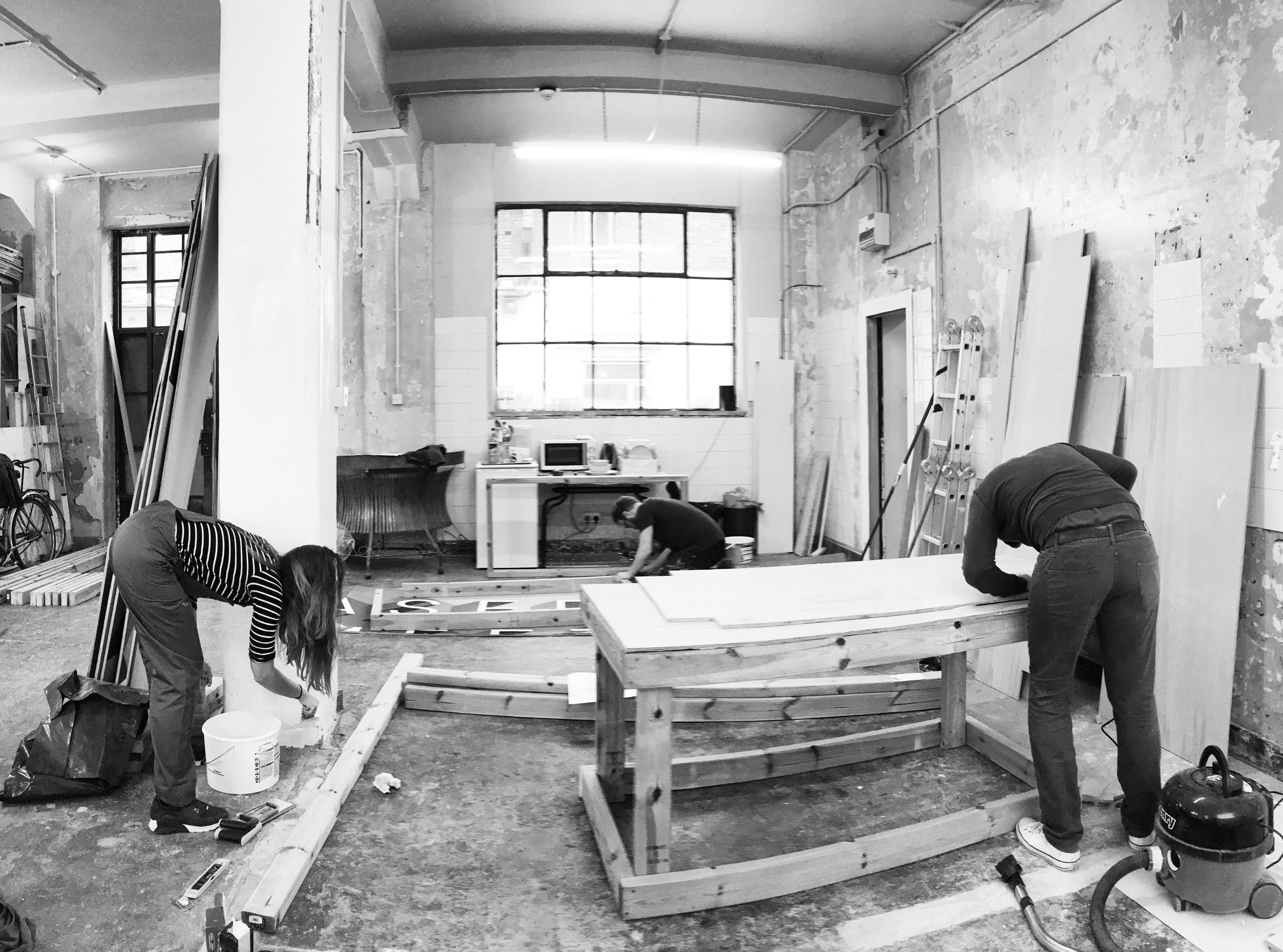
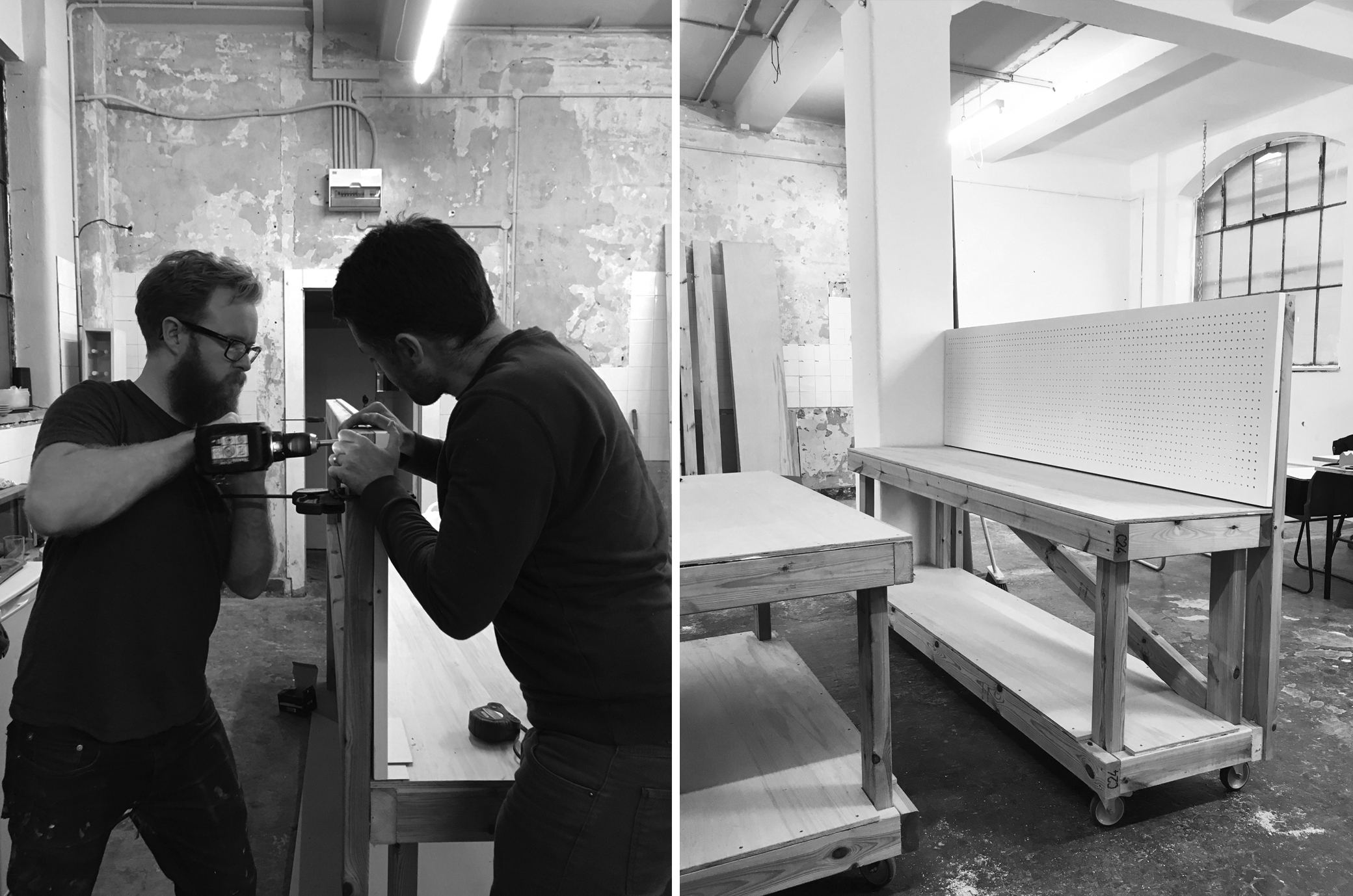
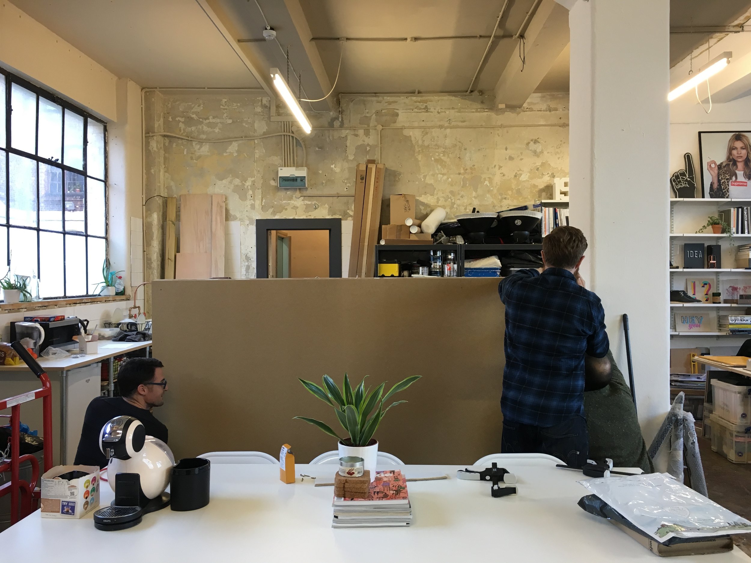
To keep costs at a minimum, we took on most of the DIY work. It took a lot of hard graft and late nights to bring to life the ideal studio environment; from knocking down partition walls to constructing work units (i.e. the kitchen and workshop benches) as well as sourcing and installing cost effective materials, furniture and fittings to create the nearest desired aesthetics.
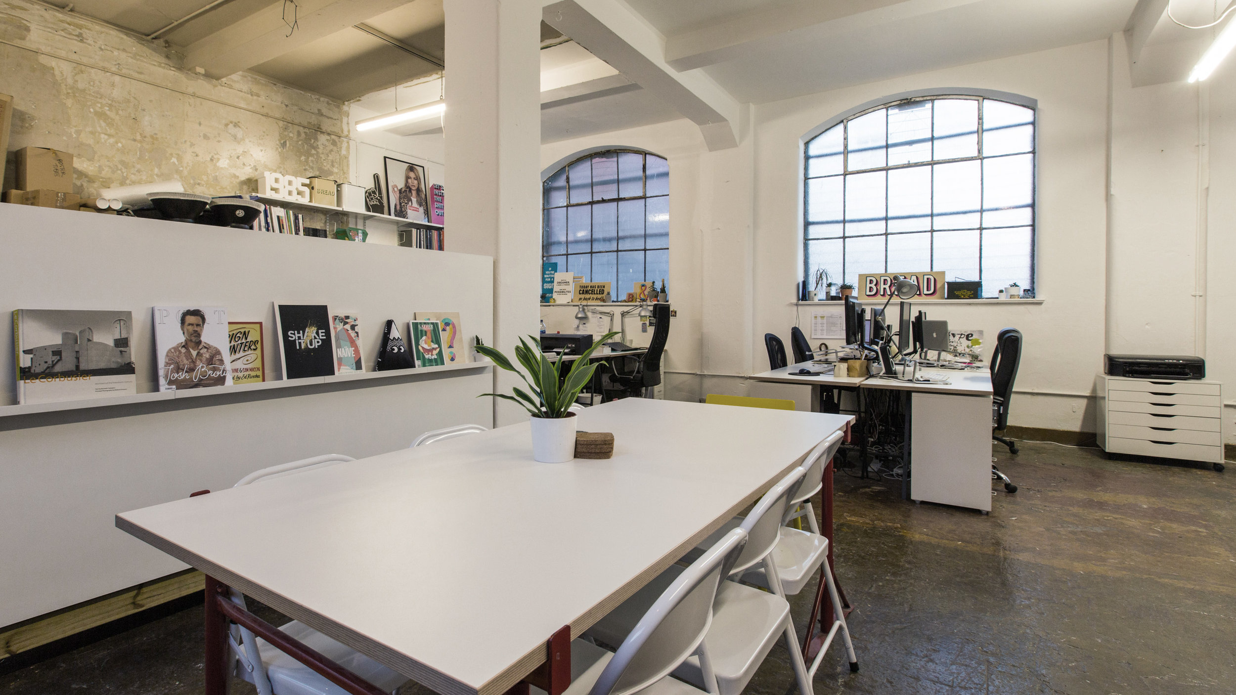
The image gallery above gives you a glimpse of all the work that took place behind-the-scenes and what you see below is the result of three months of hard core DIY! It's still work in progress but what's been achieved so far has, without a doubt, made a massive improvement to the space. There's more natural light flooding in for a start, making it feel more spacious and uncluttered. Work and communal areas are now clearly defined and functional, to accommodate all our work styles and needs as designer-makers. And what I love the most about it, is that despite all the alterations, the industrial features of the unit have not been compromised. In fact, I feel it's enhanced the space further by bringing a more harmoinius balance between the old and the new.
What do you think?
IMAGE CREDIT : Molu Designs
[All rights reserved ©MoluDesigns]
