MOLU DESIGNS

NEWS

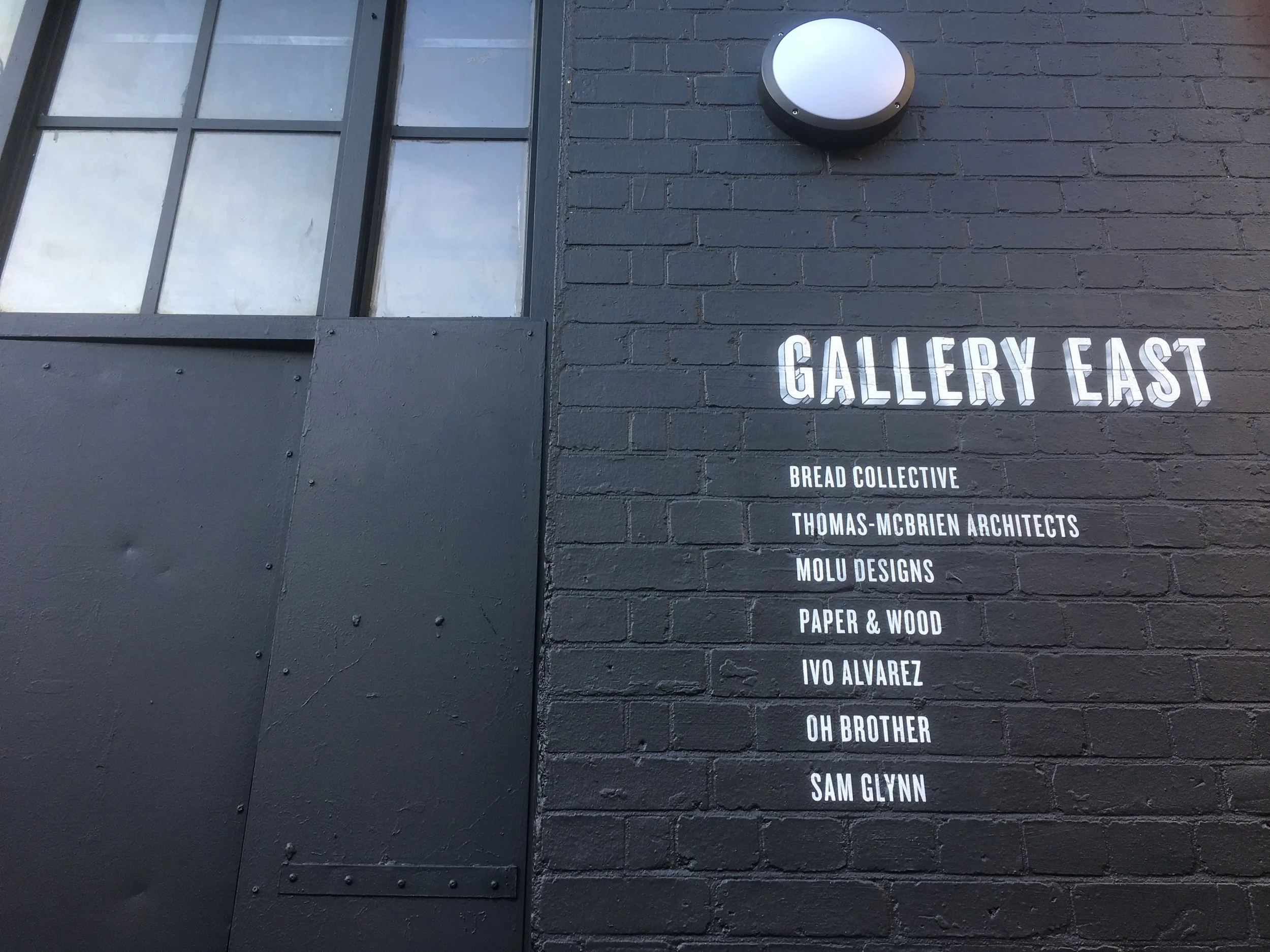
GALLERY EAST STUDIO FRONTAGE

STUDIO FRONTAGE REVAMP

Our studio frontage got a whole new facelift!

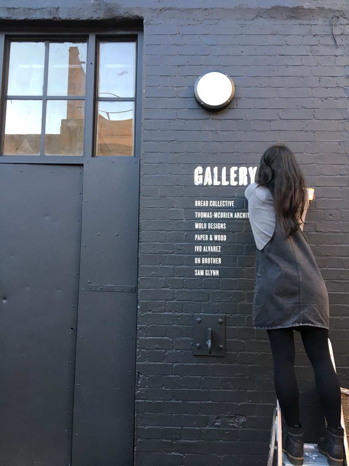
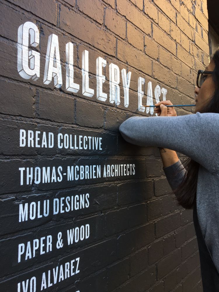
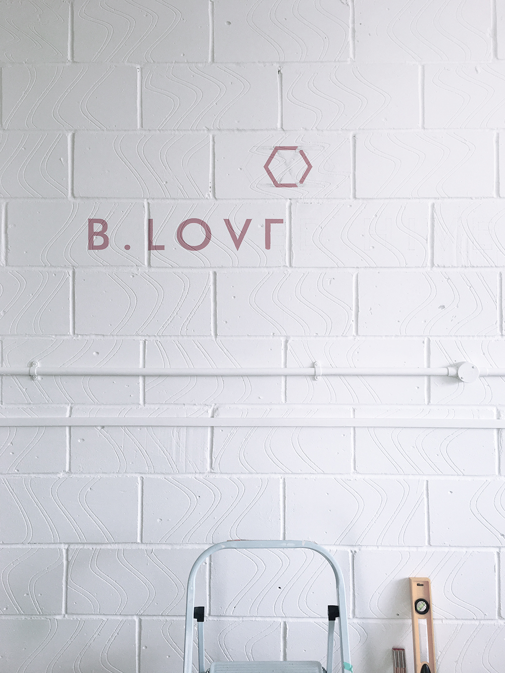
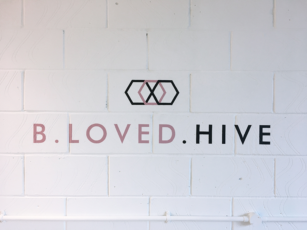
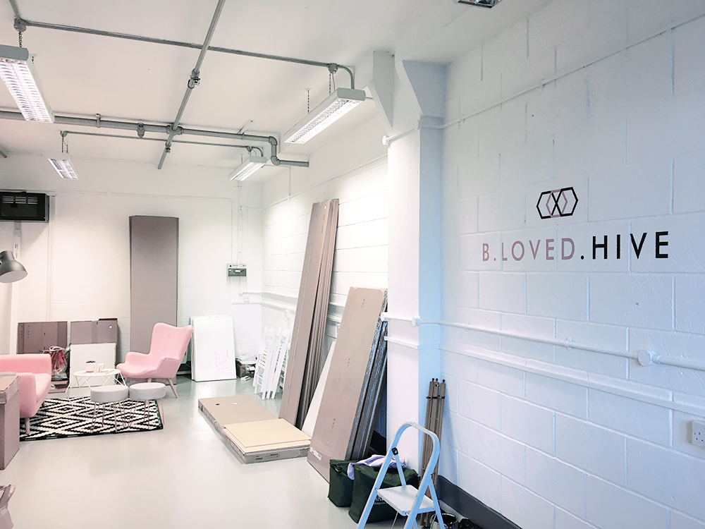
Since the whole new studio makeover early 2017, we collectively felt that the frontage needed to reflect the new interiors as well as resonate a sense of professionalism. So we agreed to paint the entire front a gunmetal grey (aka 'Railings by Farrow & Ball) and revert back to the original name Gallery East. We also decided it was best to list all the business names on the outside so that clients and deliveries could easily find us. 

Between the four of us, it took us a good solid day to paint the whole wall, including all the lettering and I have to say, it's looking pretty slick! 

So if you're ever in Limehouse, you know'll know where to find us! :) 

Molu DesignsComment
Pearl Bespoke_WIP-51.jpg

LETTERING A SHOWMAN'S WAGON

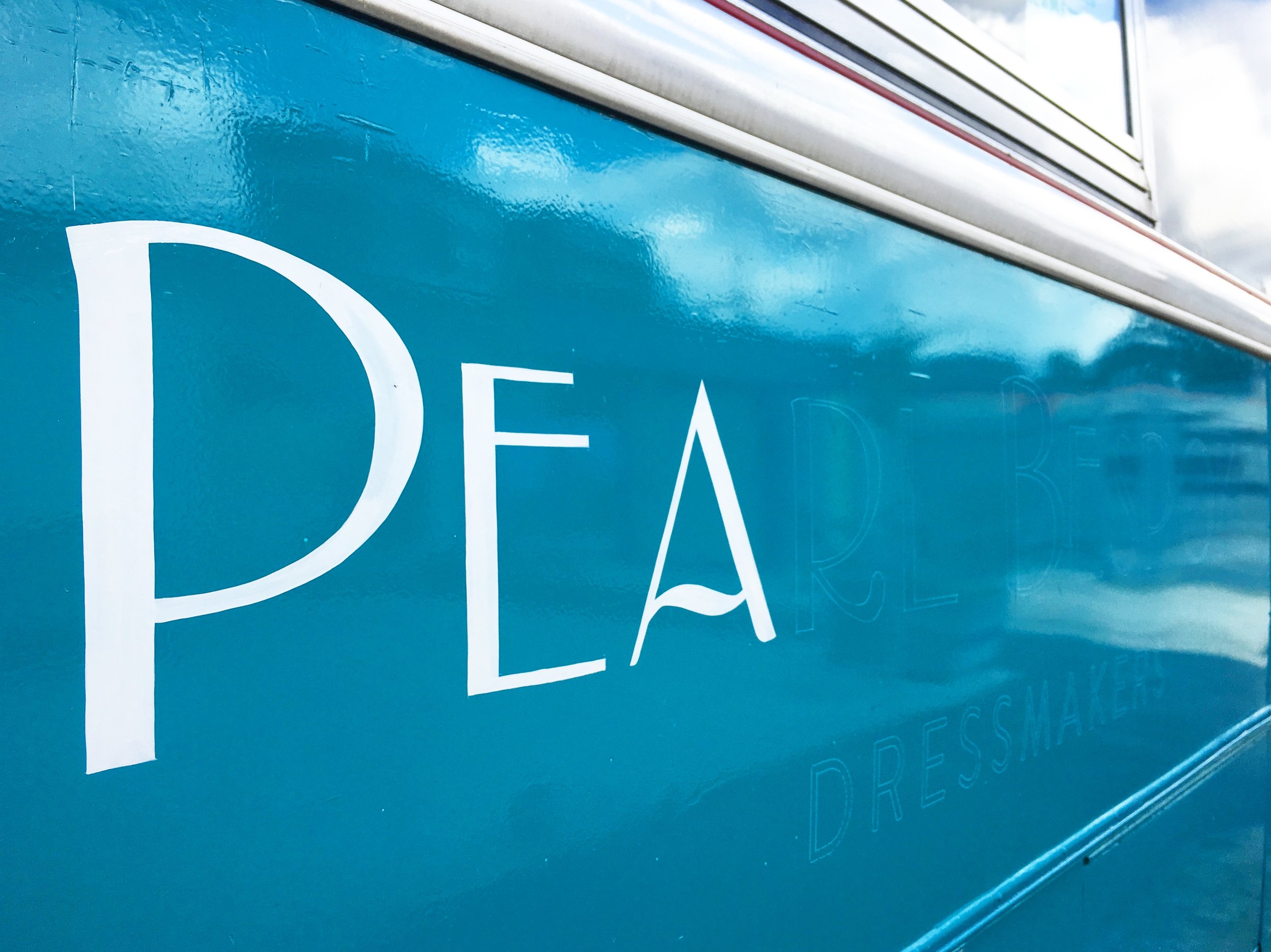
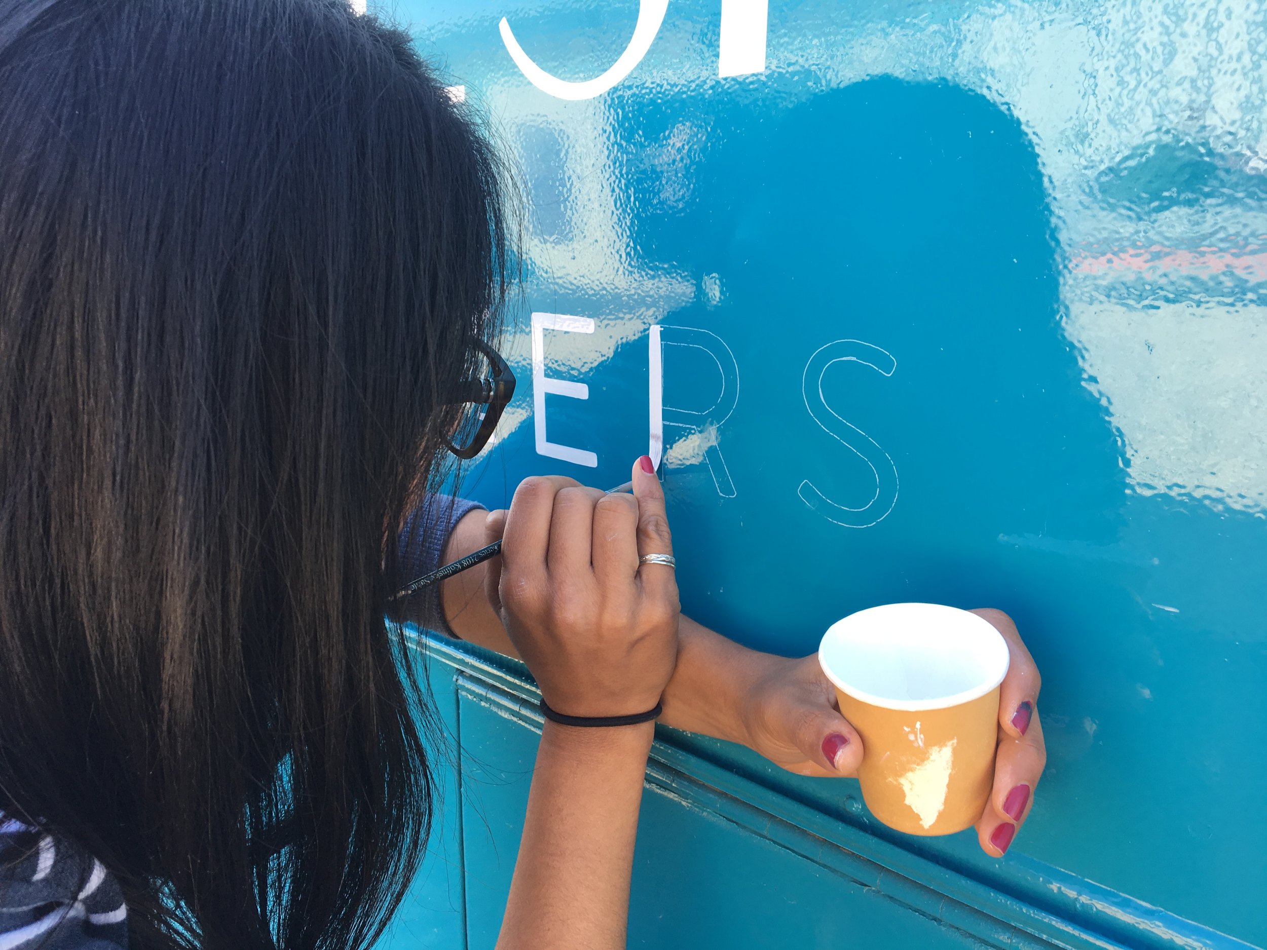
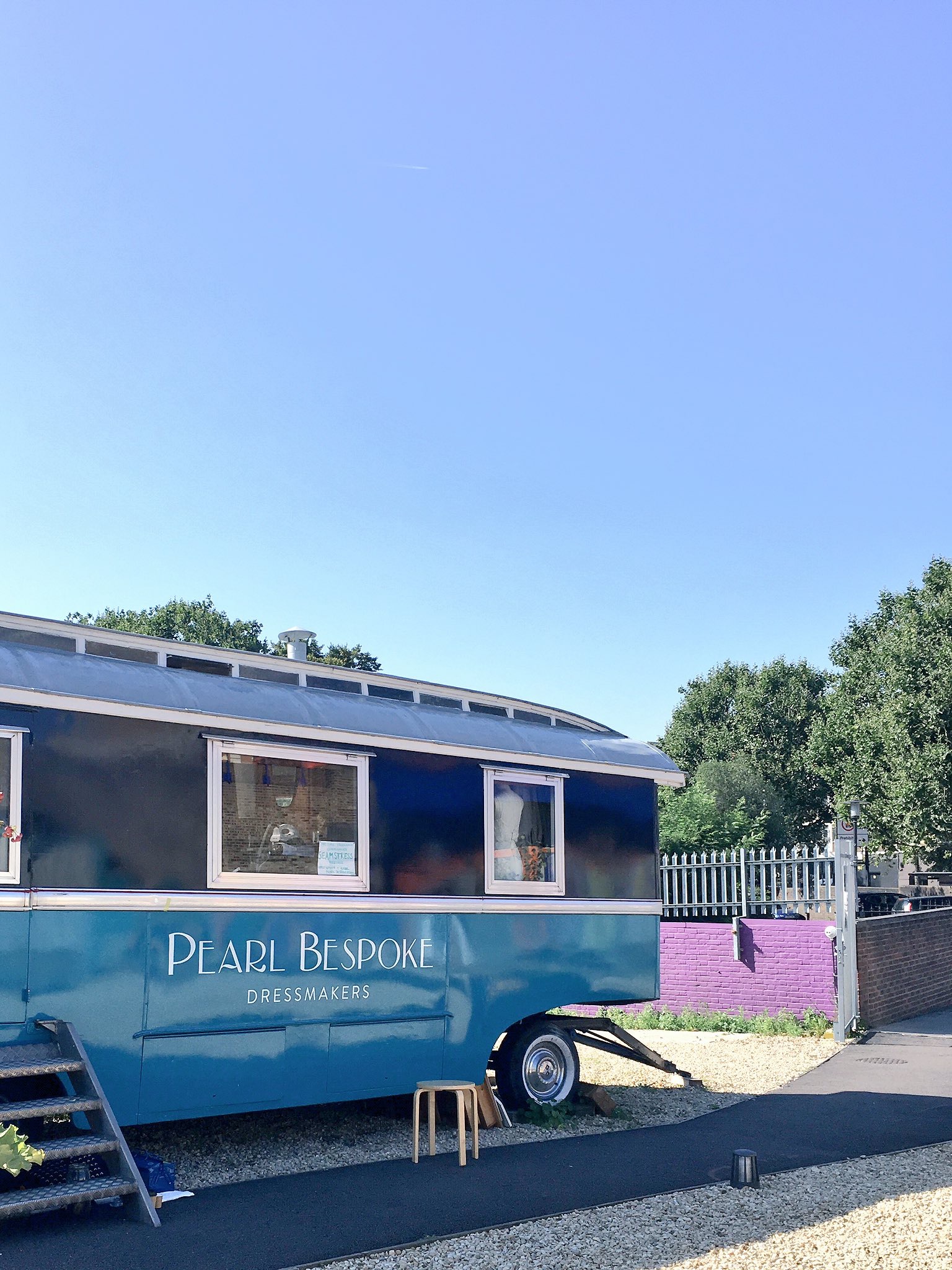
Had the pleasure of painting this fabulous showmans wagon for bridal wear designer Pearl Bespoke who recently acquired this beaut to become her mobile studio in Limehouse. Nestled within St Katherine's Precint compound, the wagon needed the business mark so it was easily identifiable from both street level and from the DLR line above. 

A simple application of the logo but one that totally helped the boutique stand out it its busy setting. It took a day's work to refine the logo and then paint it onto the wagon. It just goes to show how something so straightforward can add an effective touch to your business. 

More images to come into the portfolio section soon!

IMAGE CREDIT : Molu Designs
[All rights reserved ©MoluDesigns]

Molu DesignsComment
FRESH NEW LOOK

This has taken far longer than anticipated but I guess it's expected when you're dealing with your own identity and branding.

So here it is - fresh new look for Molu Designs. You can see of the branding here

MOLU Enamel Mug MockUp.jpg

IMAGE CREDIT : Molu Designs
[All rights reserved ©MoluDesigns]

Molu DesignsComment
MARKET SIGNAGE FOR SWEET NOTHING BAKEHOUSE

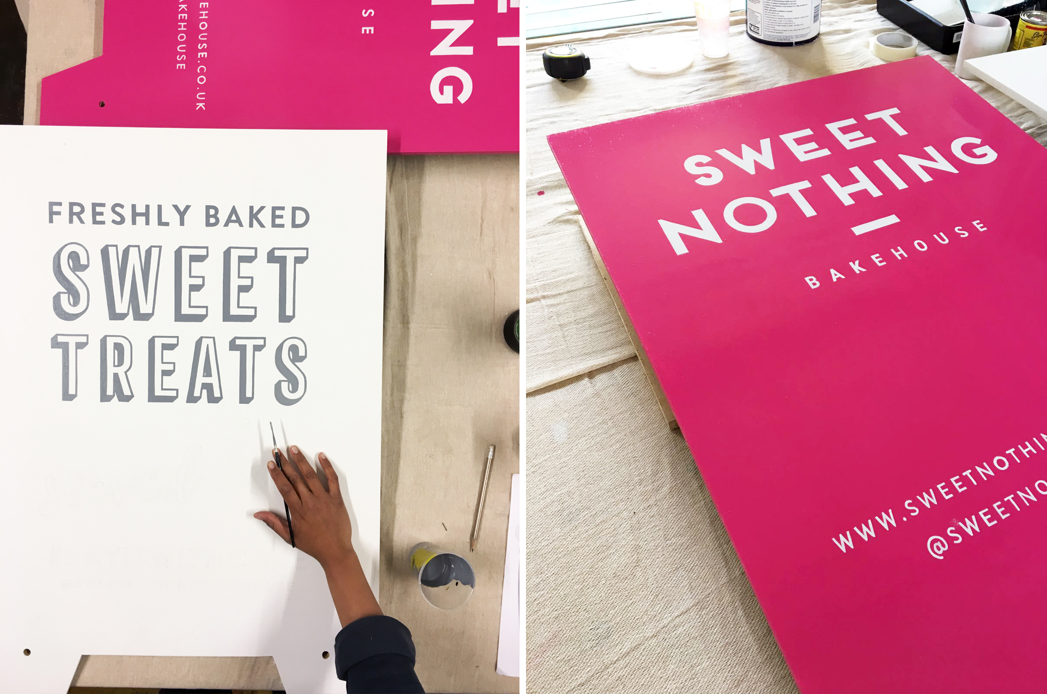
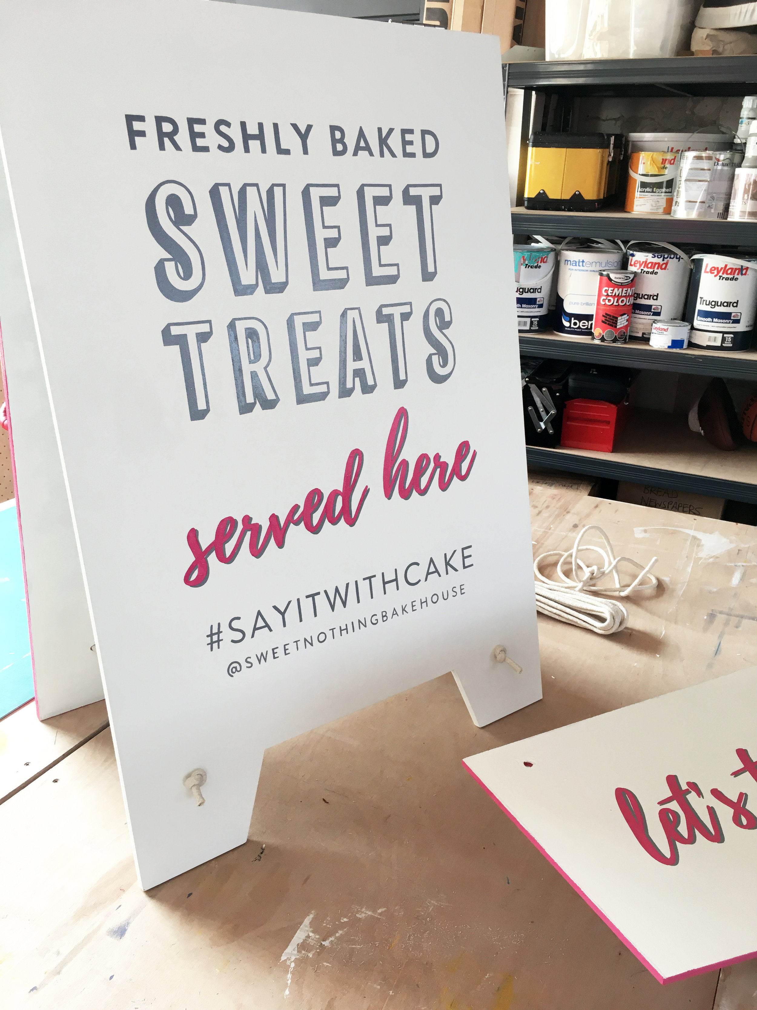
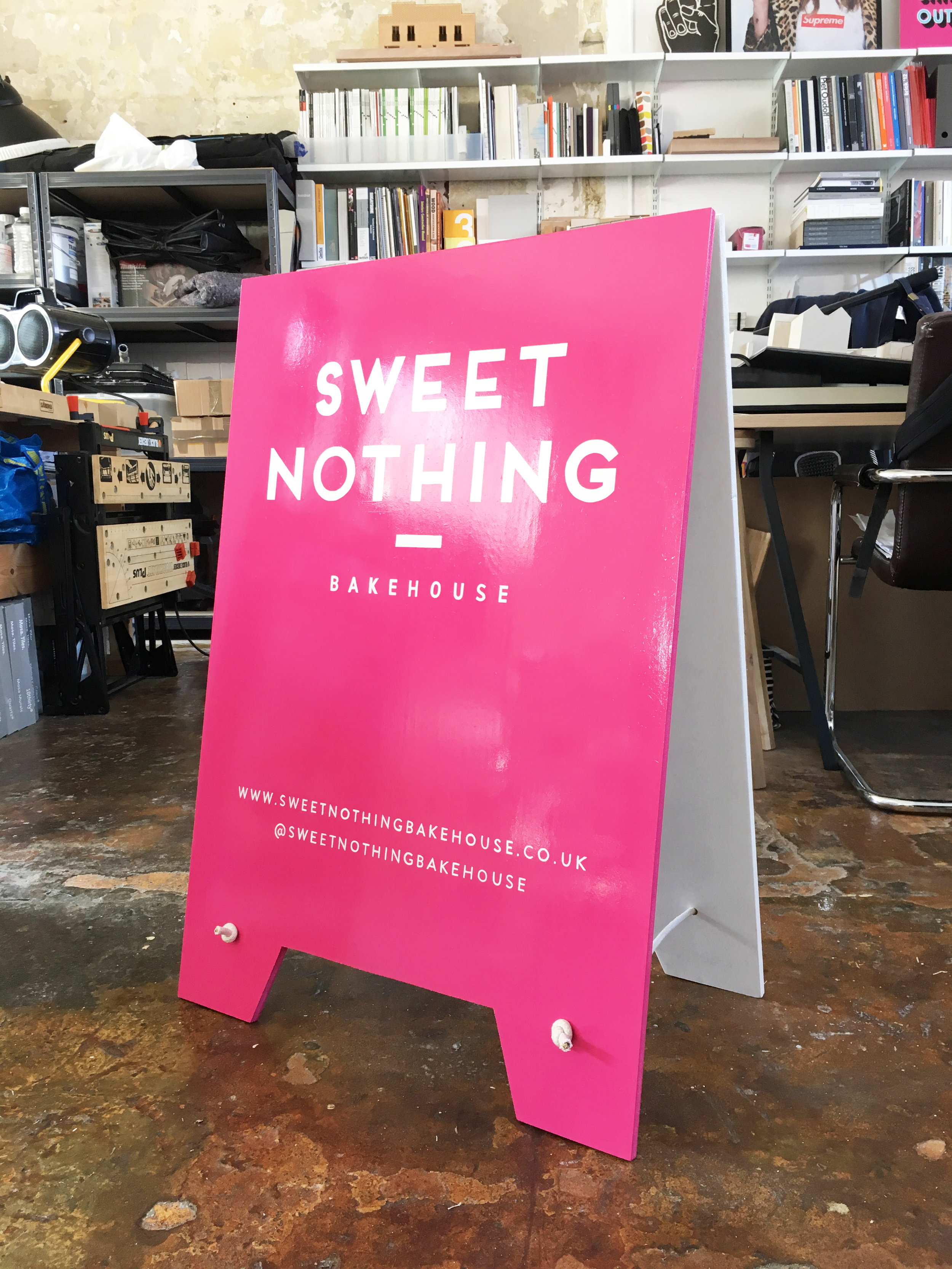
Market signage work for returning client Sweet Nothing Bakehouse which comprised of an A-board and hatch sign in their punchy brand colours that would compliment both her catering trailer and market stall on site. 

IMAGE CREDIT : Molu Designs

[All rights reserved ©MoluDesigns]

Molu Designs Comment
YOU HAD ME AT MEATBALLS

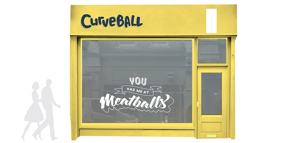
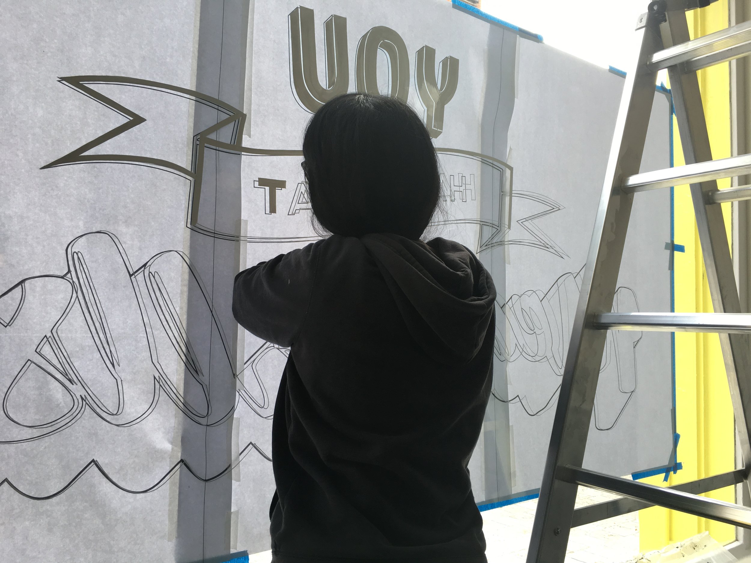
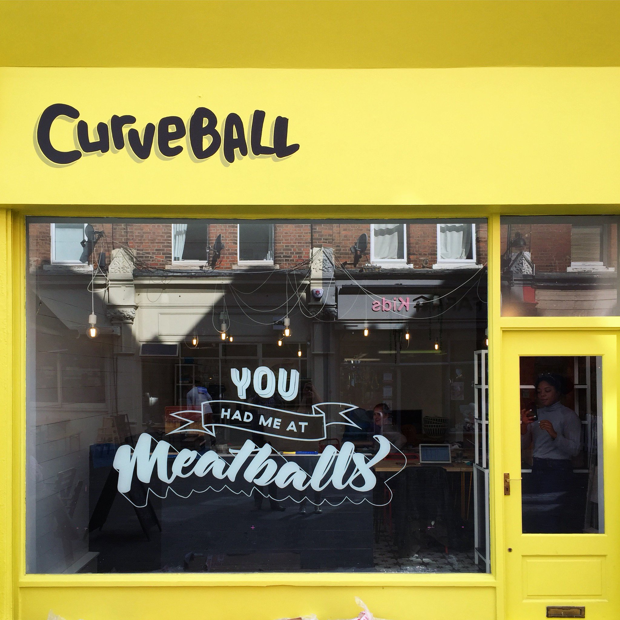
Another favourite from earlier this year (and yes, another yellow one!!)  a shopfront project I worked on this Spring for a hip, new, pop-up meatball joint called CURVEBALL opening up in Balham. I was commissioned to paint their logo as well as design and paint playful window graphics that would grab people's attention and lure them in, particularly in the the run up to their big launch.  

The premises is located on a busy pedestrianised street just off Balham high street, surrounded by numerous shops and well known eateries so it was imperative that the new spot "stood out from the crowd", so to speak. 

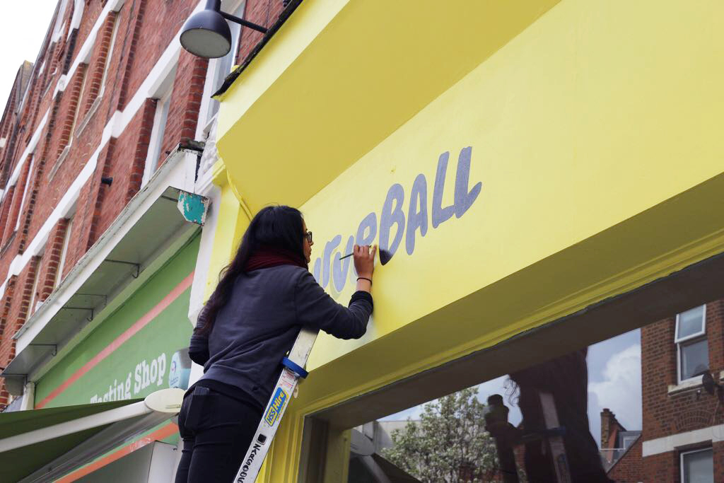
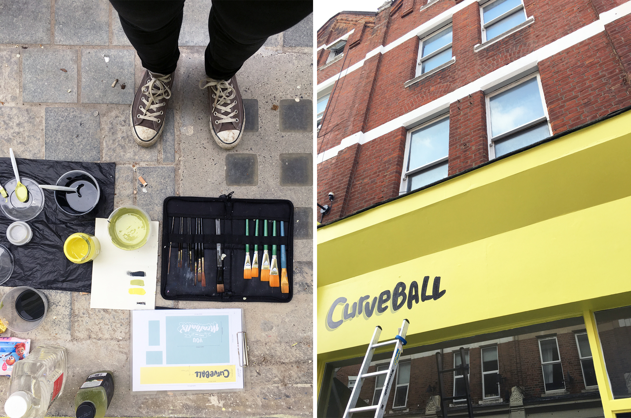
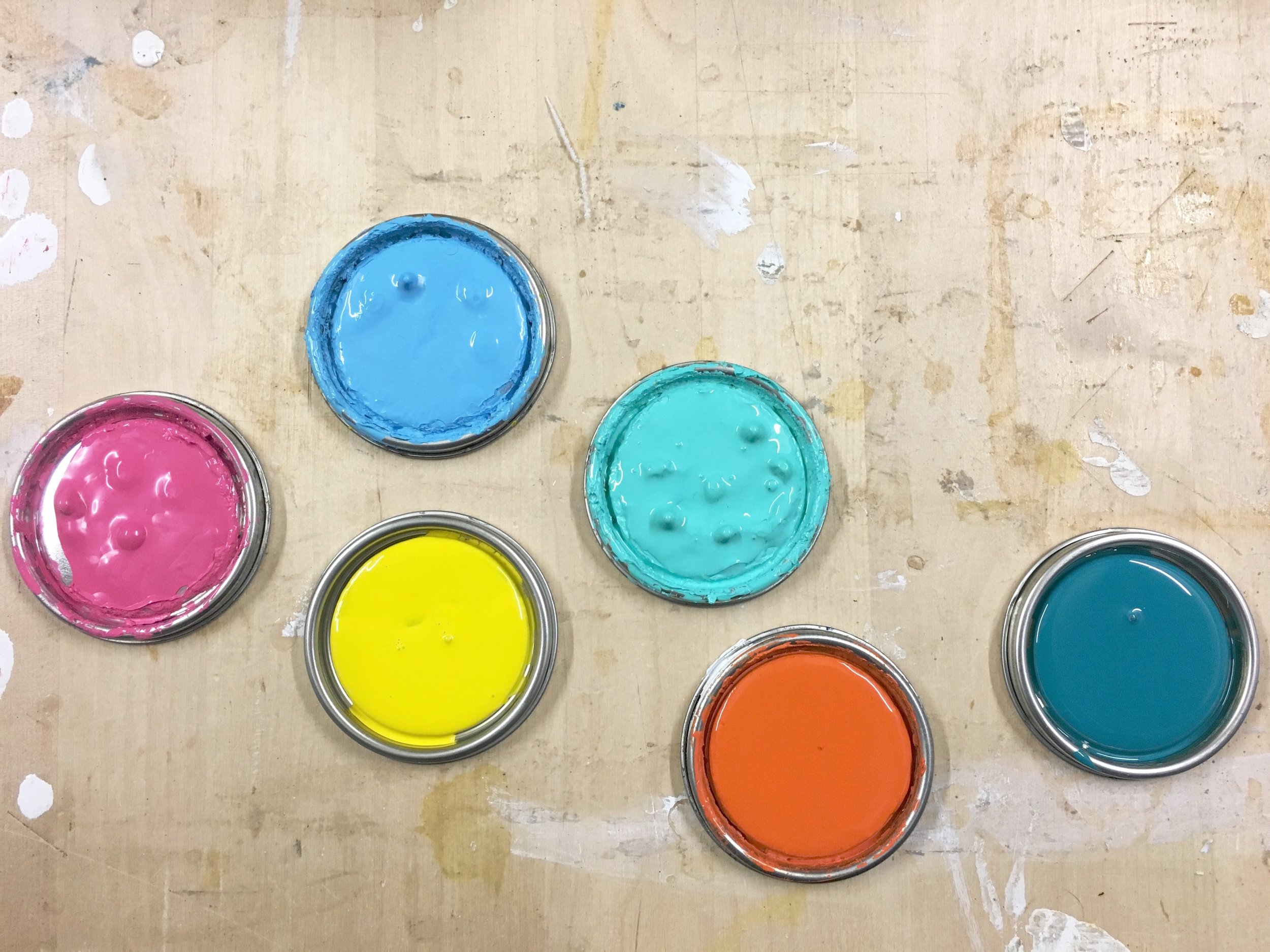
So after a series of discussions on the overall aesthetics of the restaurant, it was decided that the first move to achieve a frontage that popped out from all the distractions on that street, and stay in keeping to the brand, was to paint it a fresh, zingy colour a.k.a. 'Yellowcake' by F&B. The logo I then painted was done in a dark charcoal grey/black colour, with a subtle drop shadow, in order to maximise legibility from all points on that busy street.  

Simple yet effective.

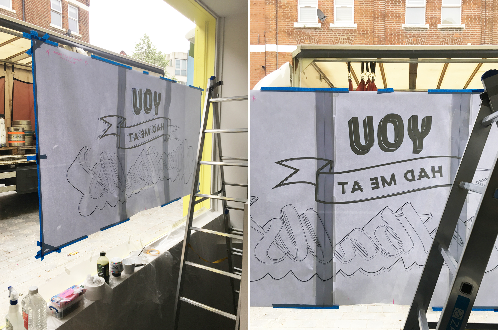
The second approach was the hand lettered element for the large picture window, that I wanted to be both fun and of course, Instgram-worthy! The "You had me at Meatballs" graphic was a playful take on the popularised catchphrase from Jerry Maguire to give passer-bys something to stop and engage with, in the hope that it leaves them wanting to know more about what goes on behind those glass panes.  And most importantly, the underlying message being that it doesn't take much for us to fall for the humble meatball! (I mean who wouldn't!?)

As for the design - I wanted this piece to explore free-hand lettering styles and compositions so that reflected both the playfulness and craftsmanship that you would find behind all the globally-inspired dishes and drinks that would be served at the restaurant. 

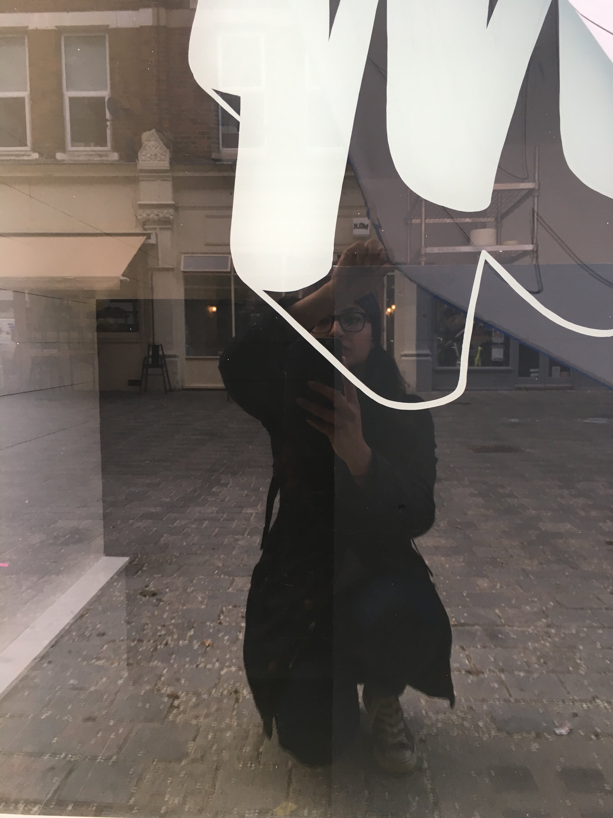
The whole job took 5days: 2days to finalise the design and 3 days to complete on site which includes all the setting up, drawing out and painting. The window graphics that spanned 2m in width, was probably the trickiest to do having had a steep and tight staircase to work from inside and decorators to work around too, but I have to say it made the job all the more satisfying seeing the finished article at the end. 

Final/official images will be coming soon to the 'Portfolio' section but in the meantime, here's a peek of how it looked a week after it's reveal. Oh and you should totally stalk their Instagram account - but be warned, it will leave you salivating... or worse, licking your screen!

IMAGE CREDIT : Molu Designs / Hannah Pemberton

[All rights reserved ©MoluDesigns]

MOLUxDFMEXICO SIGNAGE SHOWCASE

Gosh, this post is SO long overdue! I've been meaning to share these behind-the-scenes images of one of my favourite projects of 2017 but as usual, there never seems to be enough time to do it all! Better late than never though, right?

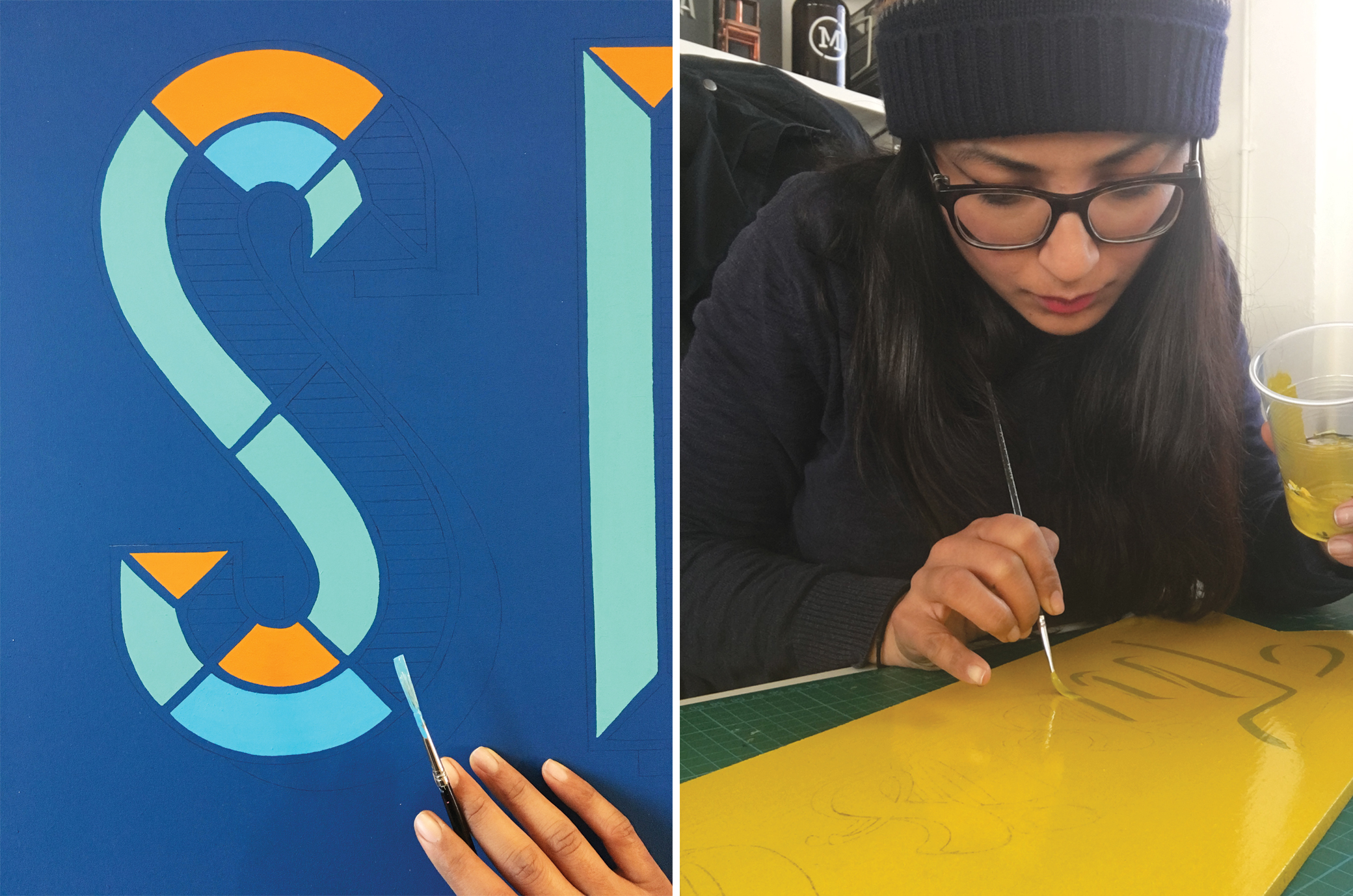
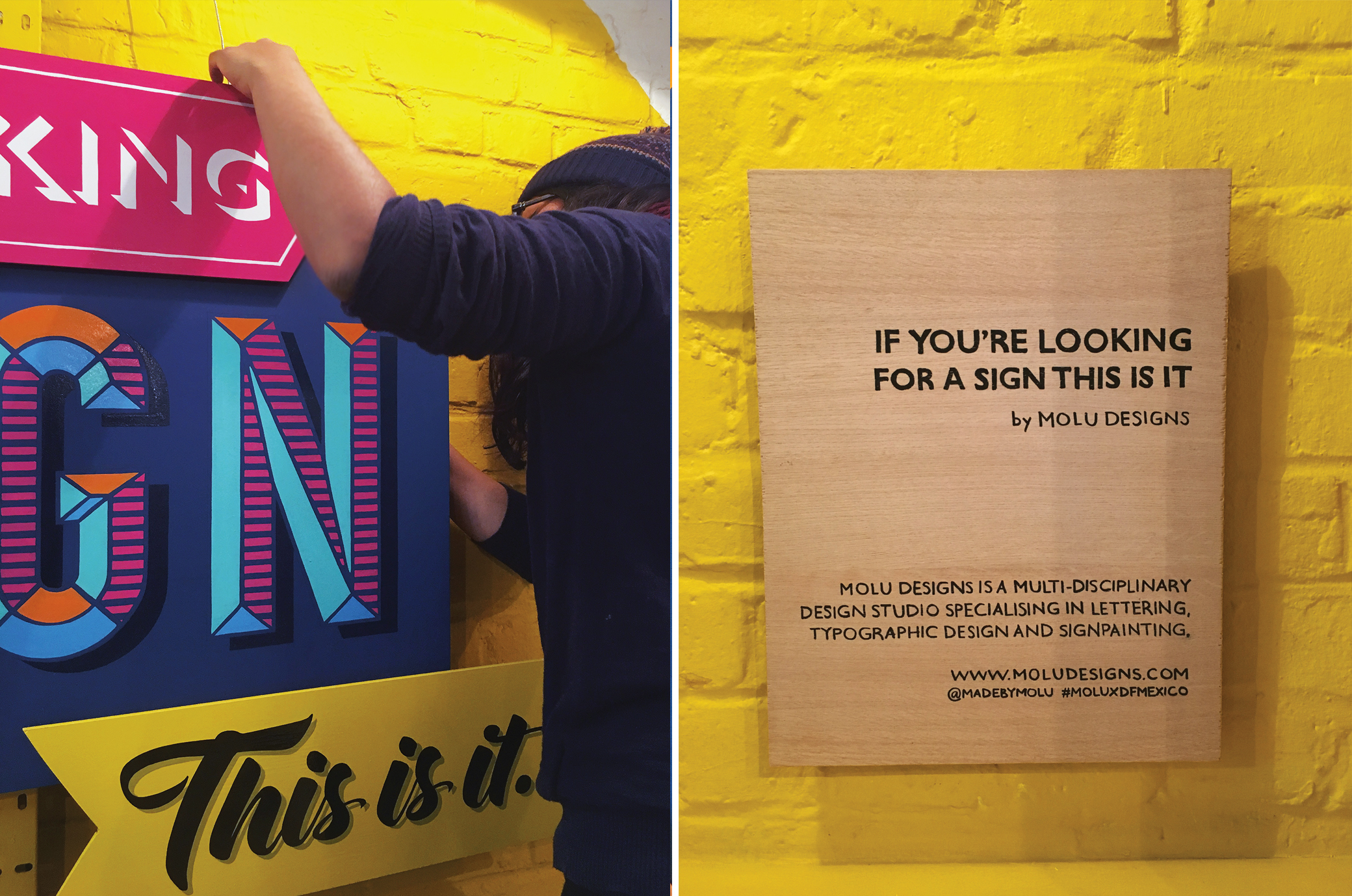
So, here's a small glimpse of all the fun, messy and labour-intensive work that went into the final piece I did for DF Mexico back in February - especially if you missed the snippets I shared on IG and twitter back then.

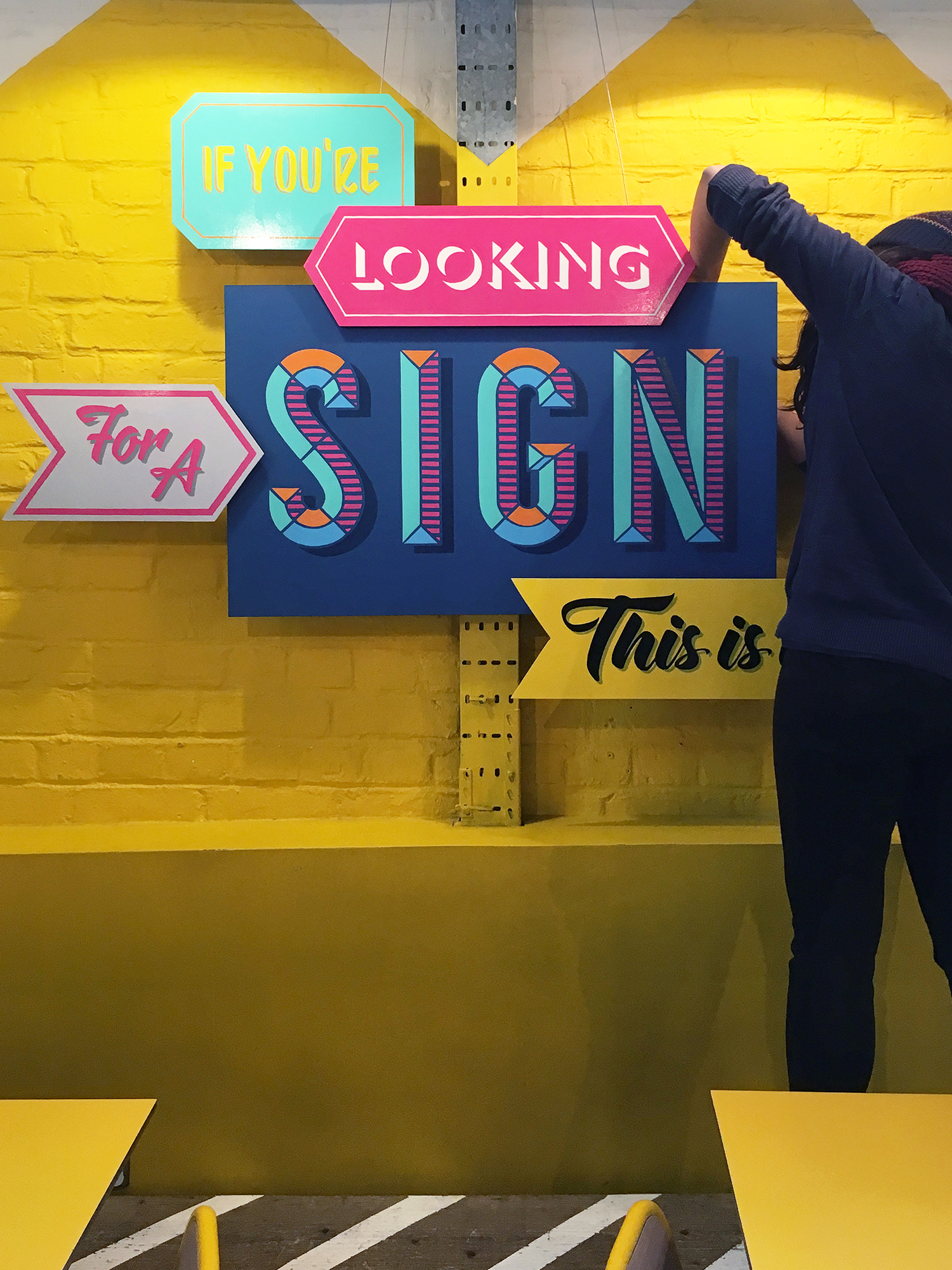
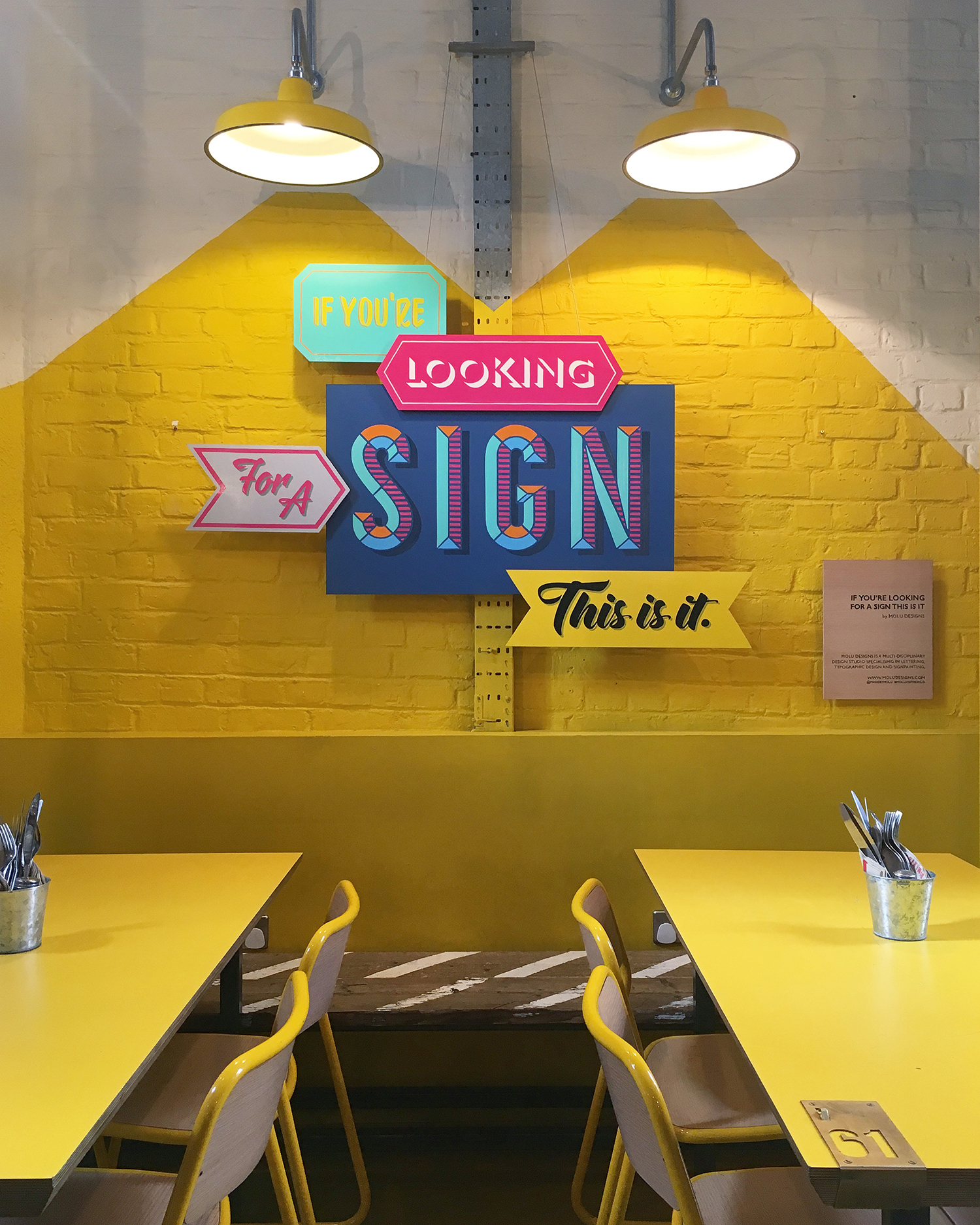
This piece  was designed and created for the DF Mexico's Shoreditch premises. If you're familiar with the place, their wall by the entrance (with the striking yellow painted graphics) was simply screaming for something eye-catching. And me being me, it obviously had to be type-based and a fun catch phrase of sort, one that would stop punters in their tracks.

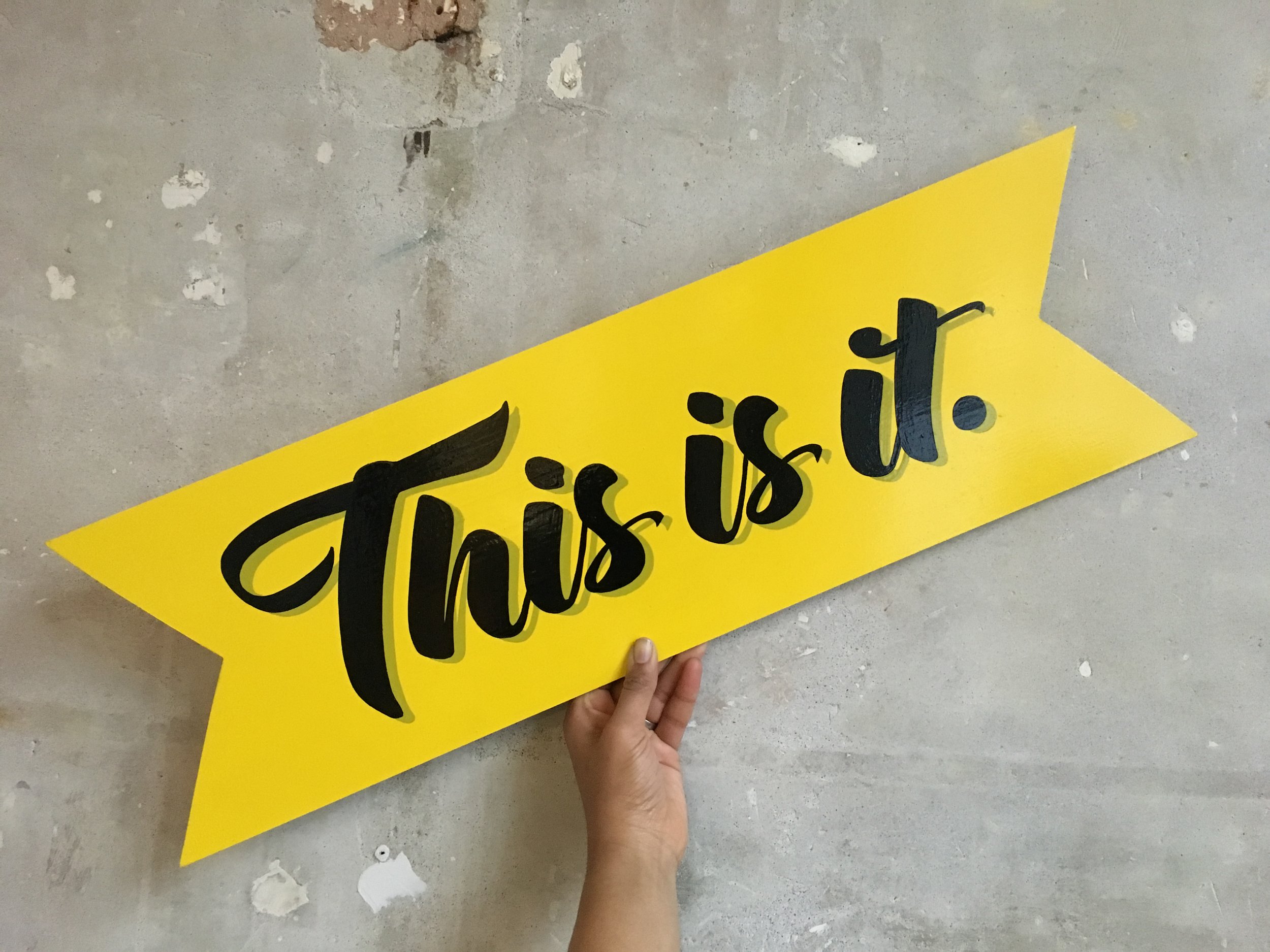
So, after exploring various avenues, I decided on the phrase 'If you're looking for a sign, this is it'. I love how it simple and literal it is. Not to mention being a fun, tongue-in-cheek nod to my line of work as well as being open to interpretation to all those who would encounter it. 

The key statement phrase was broken down into individual signs, where each piece explored a different lettering style using bold Mexican-inspired colours, and layered in a collage-like format.Each piece was painstakingly hand-cut, hand-lettered,&nbs…

The key statement phrase was broken down into individual signs, where each piece explored a different lettering style using bold Mexican-inspired colours, and layered in a collage-like format.

Each piece was painstakingly hand-cut, hand-lettered, hand-painted and assembled on site!

So there you have it!

If you're ever in Shoreditch by Truman Brewery, do stop by and check it especially over their awesome tacos and frozen margaritas!! We've had many folk tweet and instagram it already, so if you're on social media do share all your amazing pics using the tag #MOLUXDFMEXICO a long with @madebymolu and @dfmexicodiner so we can all have a nosey!

Official photos can be found here.


IMAGE CREDIT : Molu Designs

[All rights reserved ©MoluDesigns]

NEW STUDIO VIBES!
Photo 22-10-2016, 11 28 29.jpg

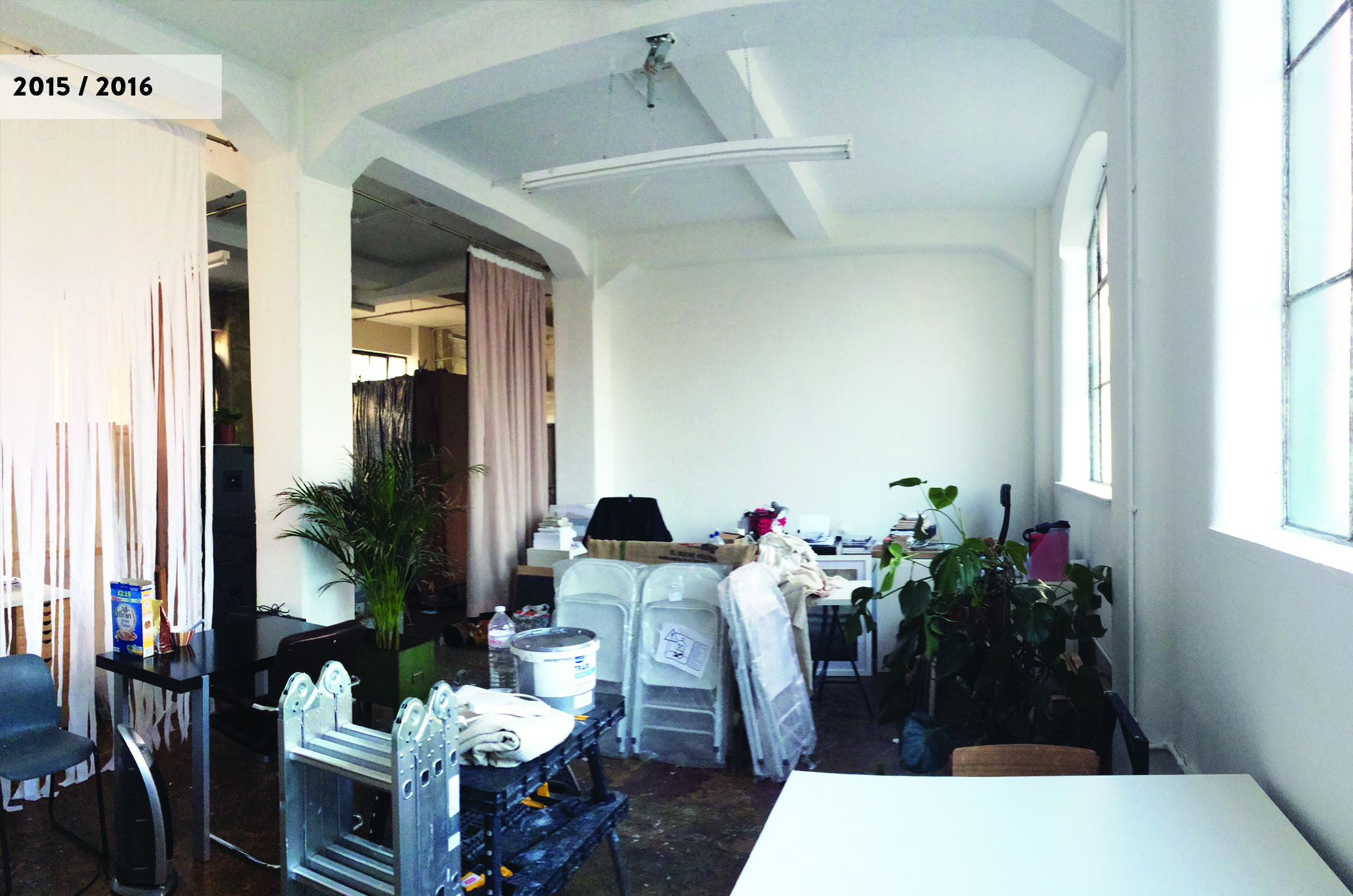
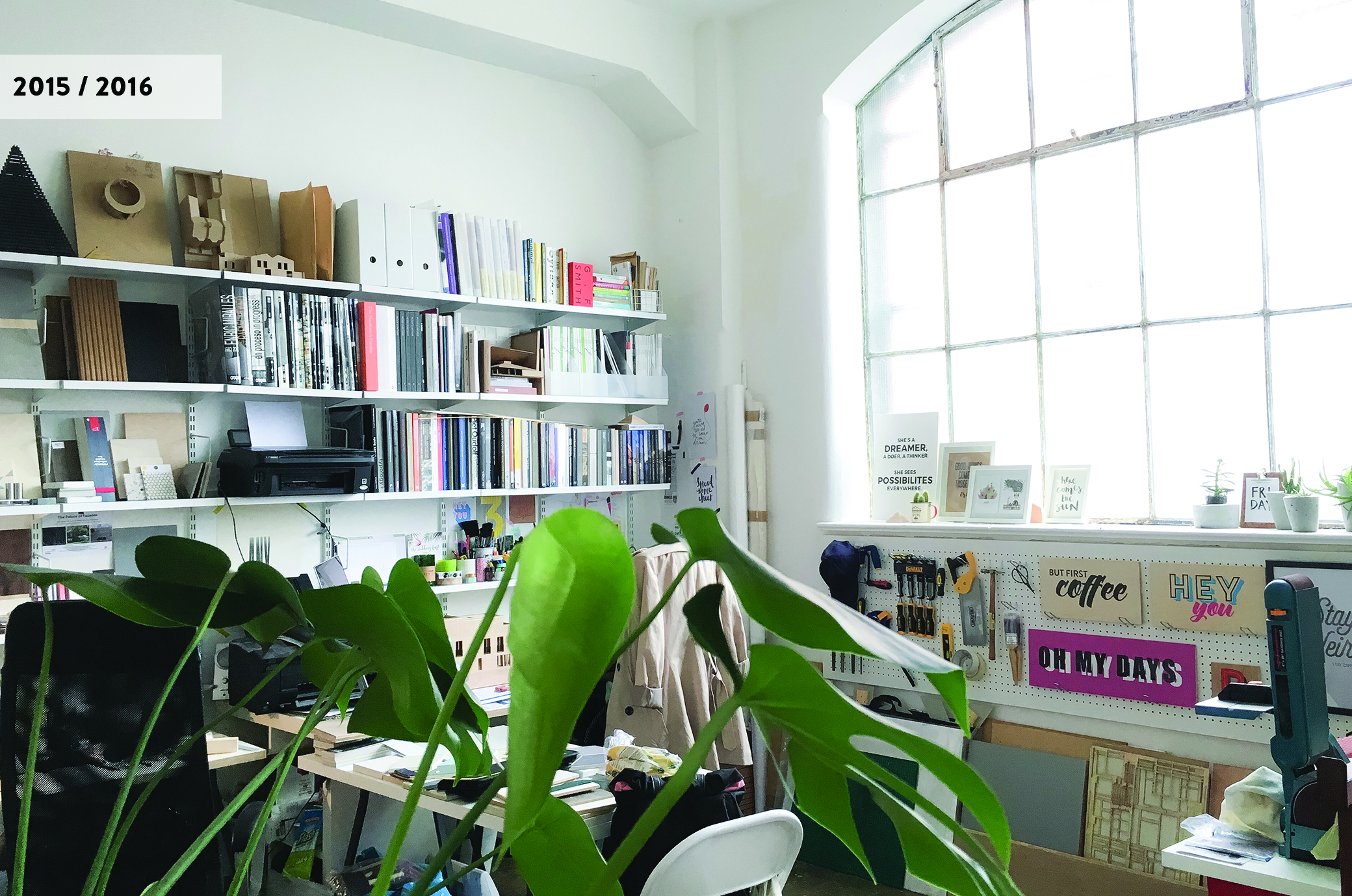
We've had some exciting changes take place within our studio early this year that has brought an entirely new look and vibe to the space, so I thought I'd share a few images of all the major changes the space has seen since we first moved in 2.5years ago!

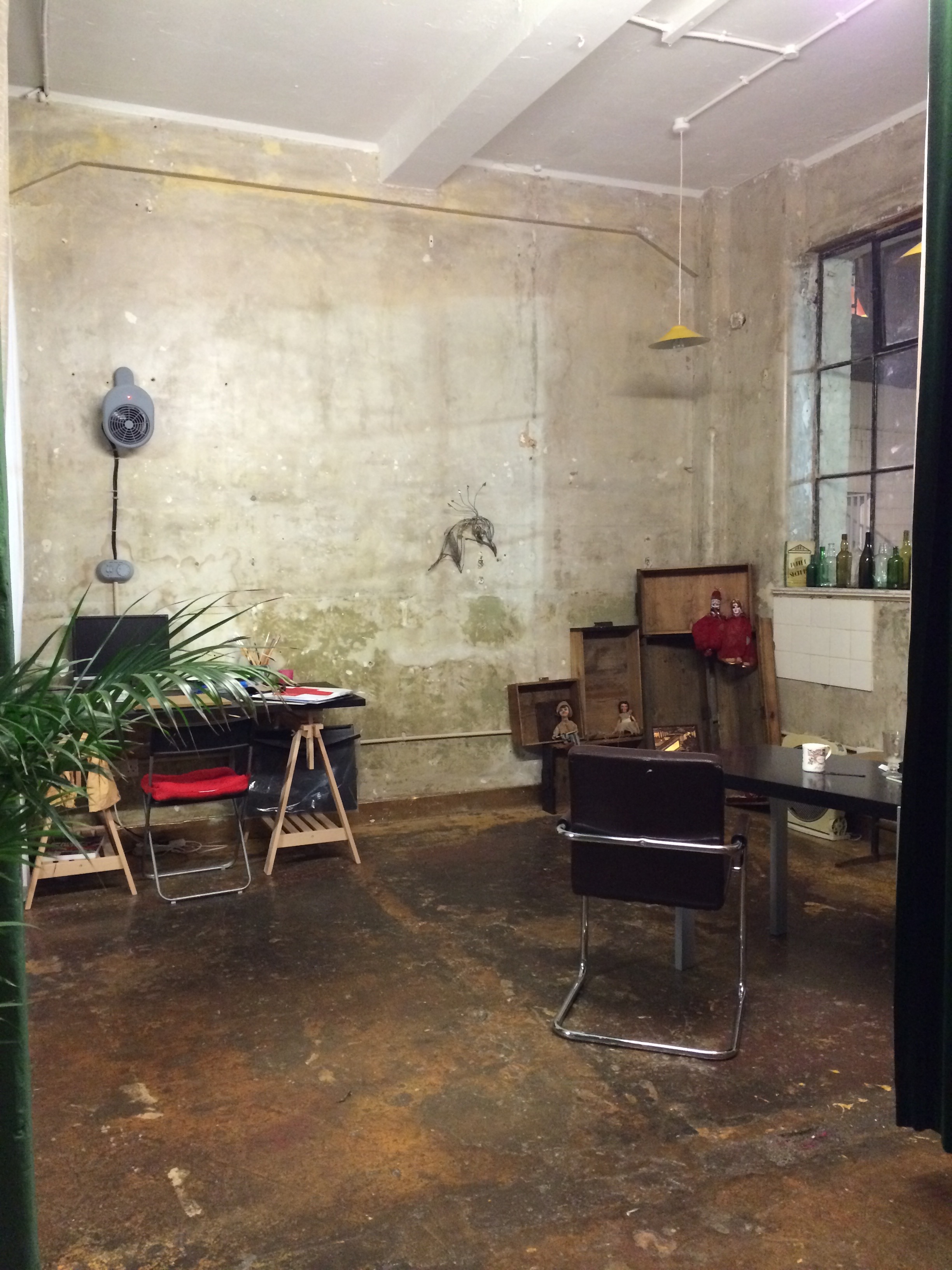
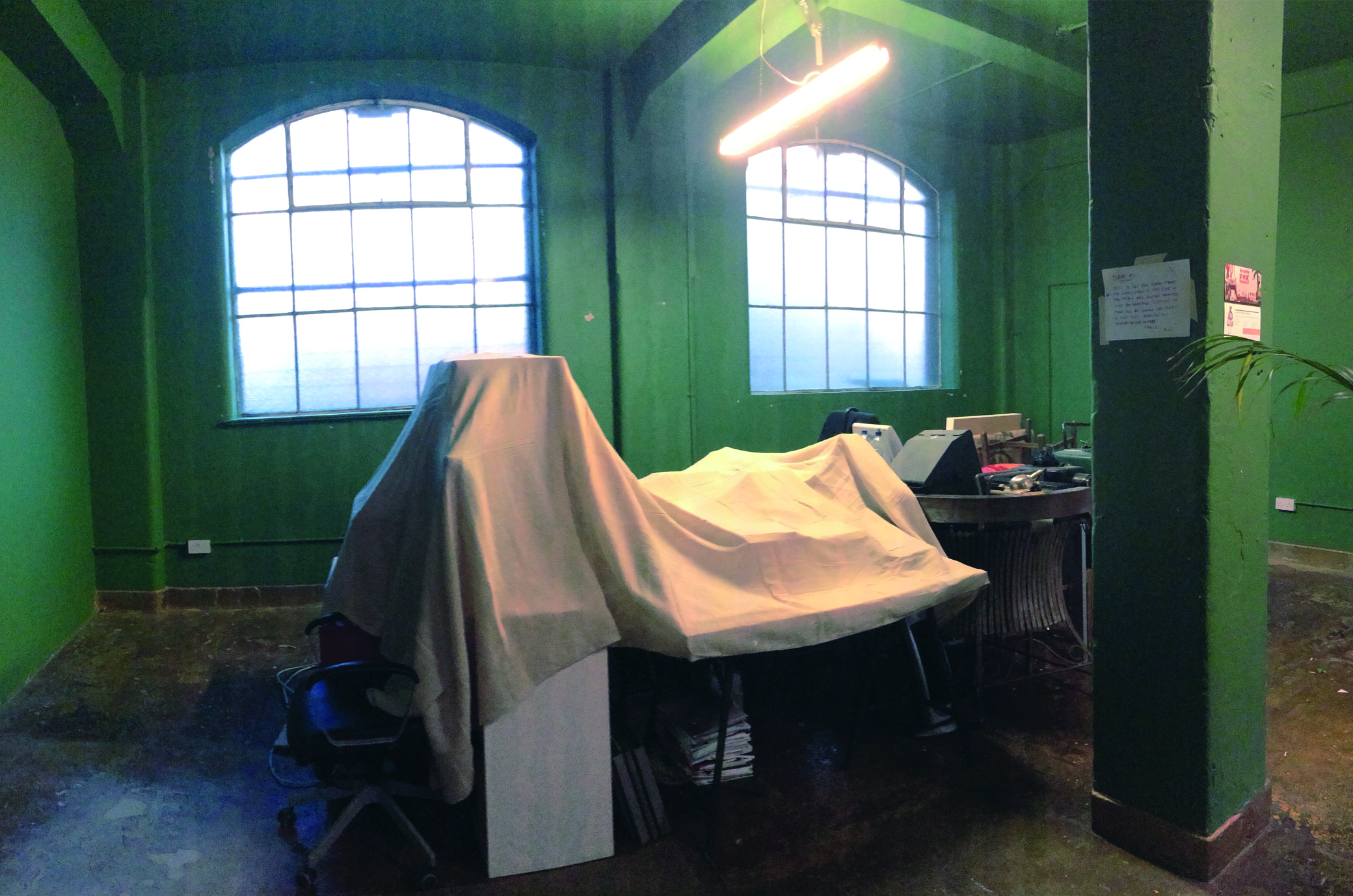
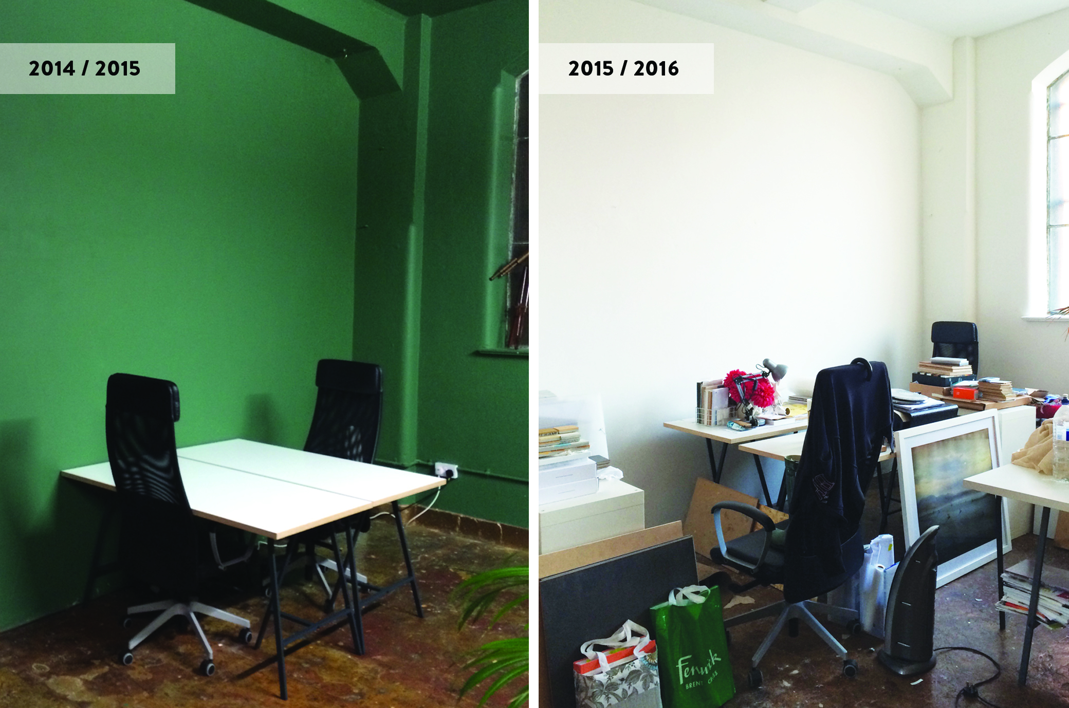
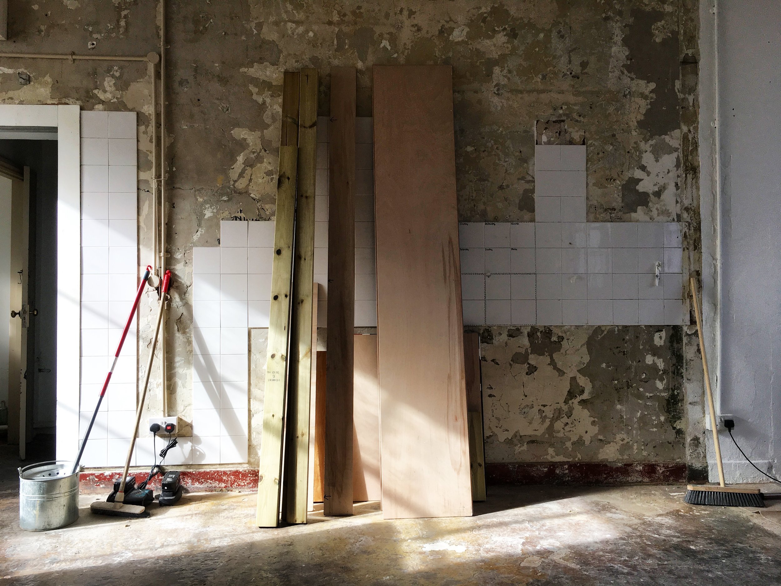
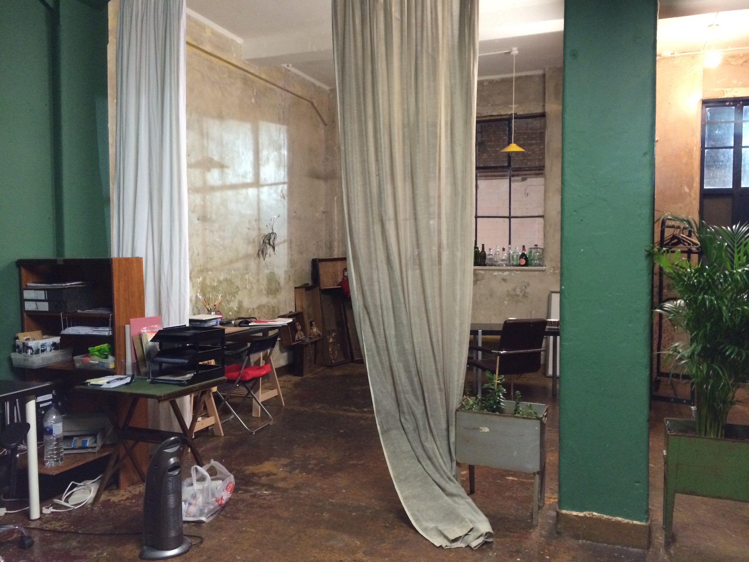
Before it turned into a co-working shared space, the unit had been leased out for photoshoots, film showcases etc so when we first moved in winter of 2014, the large Victorian unit, with all it's lofty, industrial, warehouse charm, had a more atmospheric and somewhat theatrical vibe to it. It wasn't your typical slick industrial studio space that you'd find all across in East London but one with deep rooted character and history. One half of the studio had exposed walls that revealed so many layers of textures. The other half was painted in a deep green that I must say, made you feel like you were part of this really cool Wes Anderson film set!. 

Anyway, over the next year and a half, the studio quickly filled up with creatives and workspaces were personalised to suit each of our work and personal styles. The layout, as a result, kept changing constantly to accommodate everyone. Communal areas eventually became non-existent, and the studio ended up becoming, what was in effect, several pockets of individualised spaces within a large space. And with more folk moving in and out over the year, the studio gradually lost all the charm, the lofty open-plan space, once had. As for the overall aesthetics - what was once spacious and unique soon looked sombre and cluttered.
IMG_7545.jpg

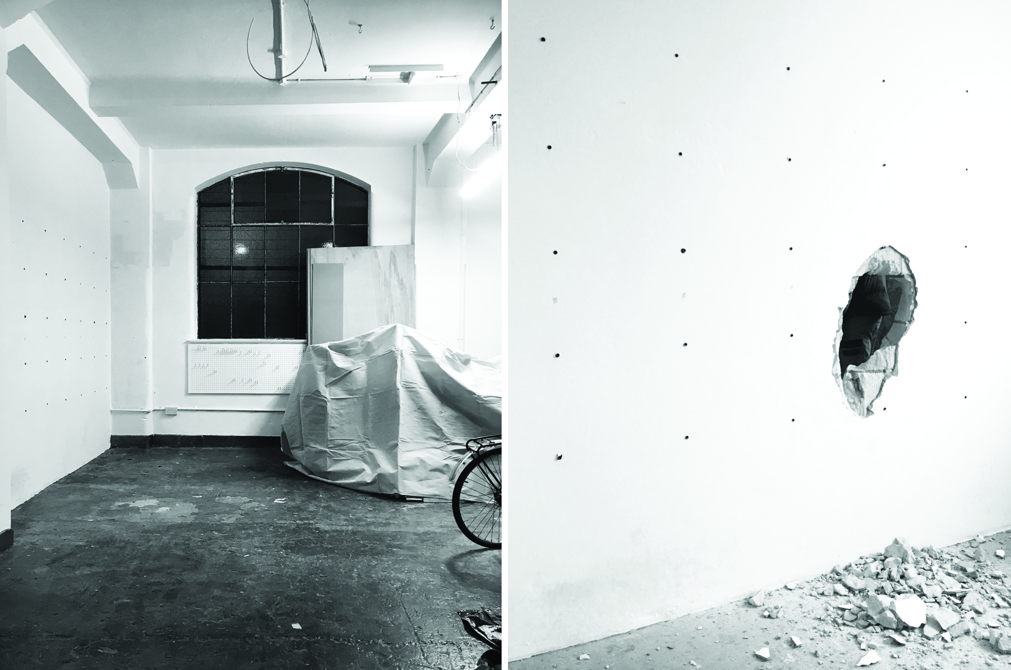
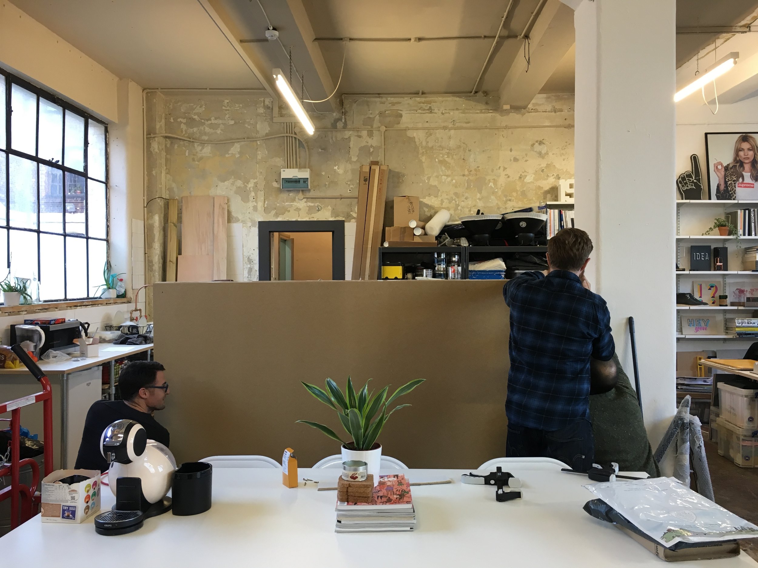
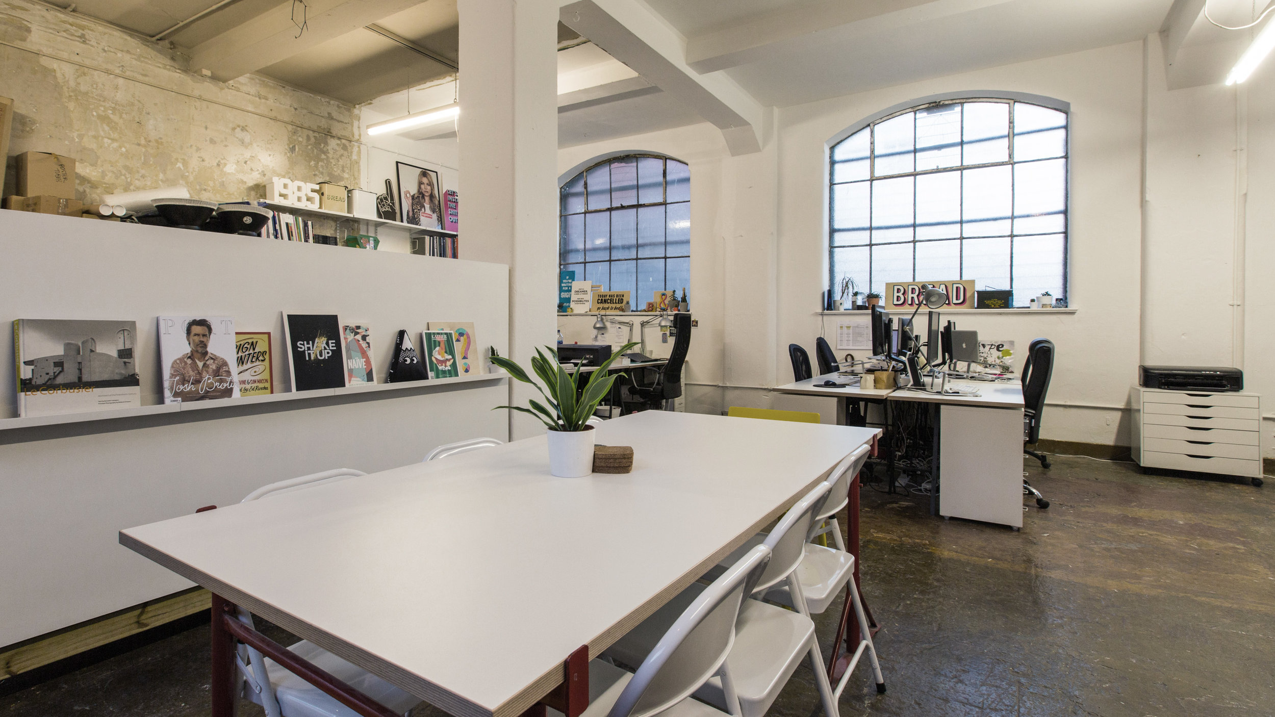
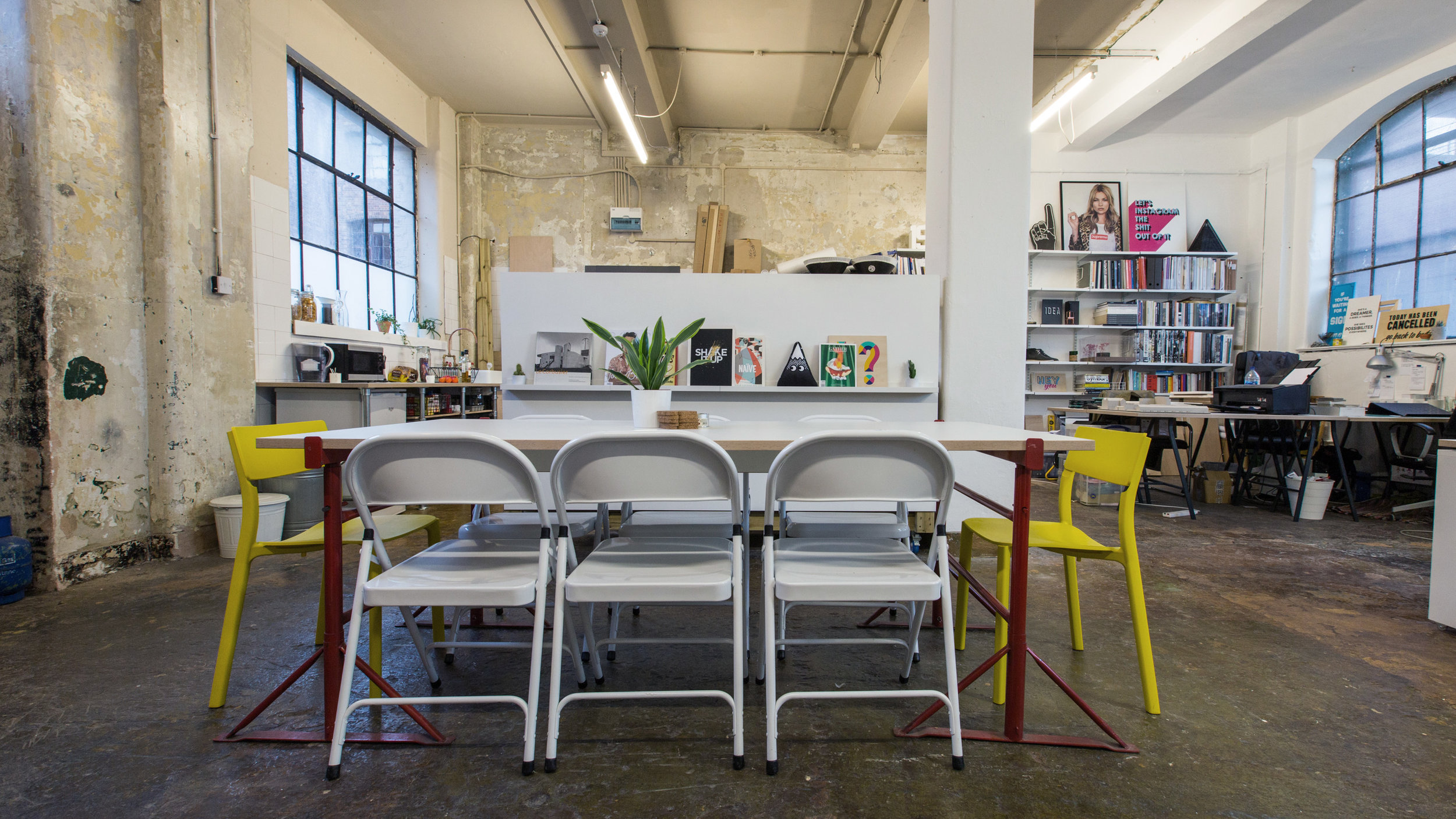
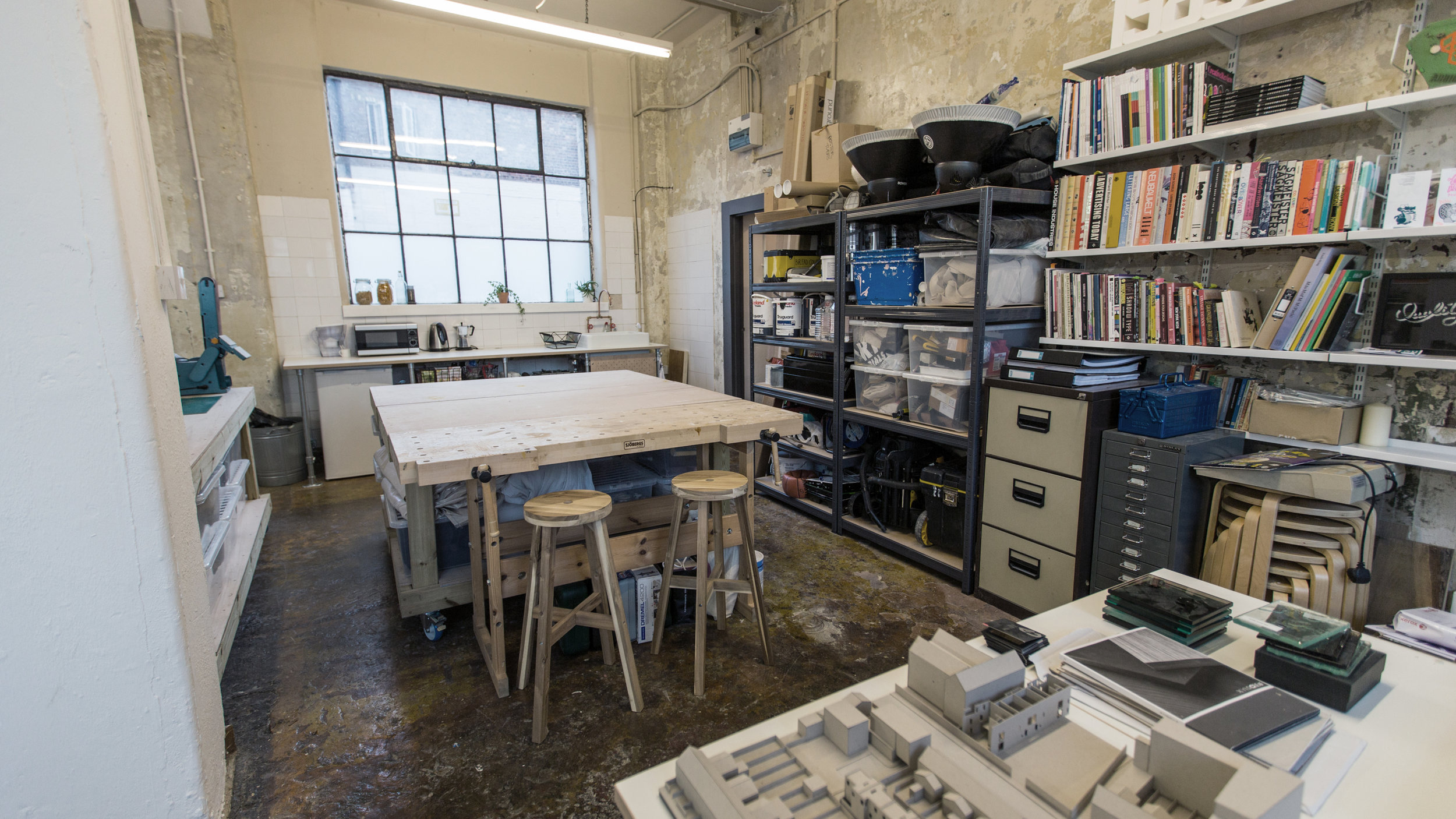
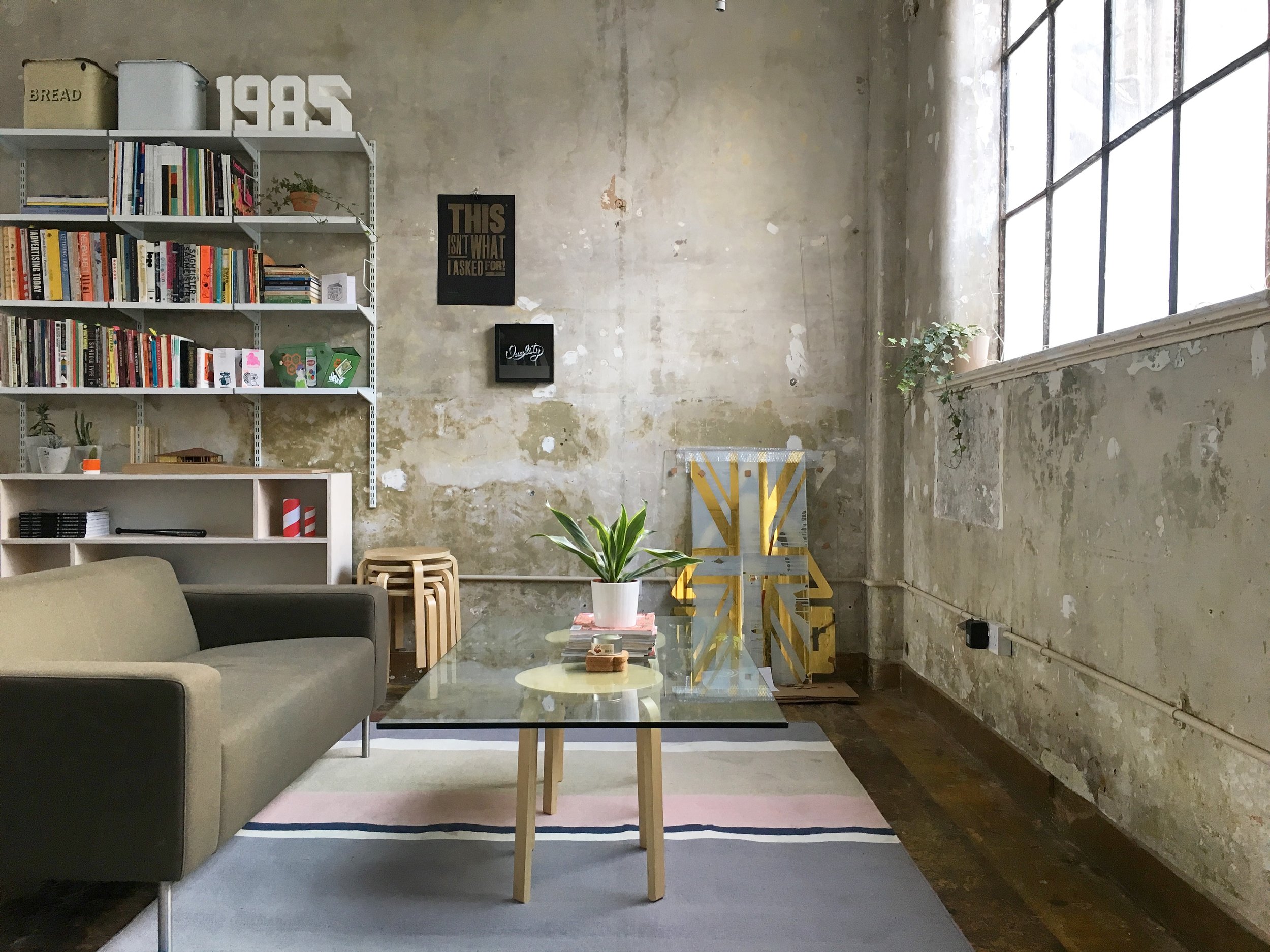
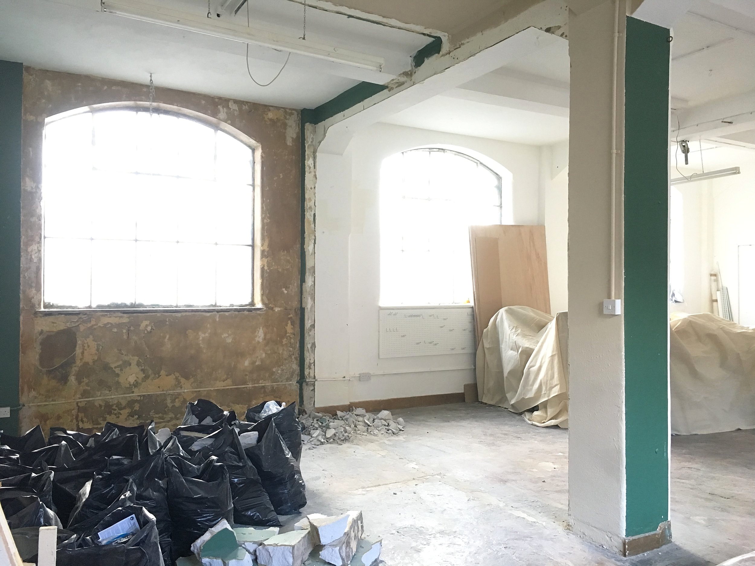
Thankfully last autumn, an opportunity arose for a change, and collectively a bunch of us decided to revamp the entire space by opening up the floorpan further (back to it's original layout) to create more defined and functional work areas and dedicated communal spaces such as workshop, meeting and lounge areas. For most of us, being freelancers and small businesses, the studio basically acts as a second home with many hours (far too many at times!) spent working in it so it was imperative to create a healthier and inspiring work environment where we weren't just sat at our desks 24/7! This meant having a fully functioning kitchen area for our meals and coffee/tea breaks, workshop area to accommodate labour-intensive work like model making and sign-painting, and break out spaces to retreat to. 

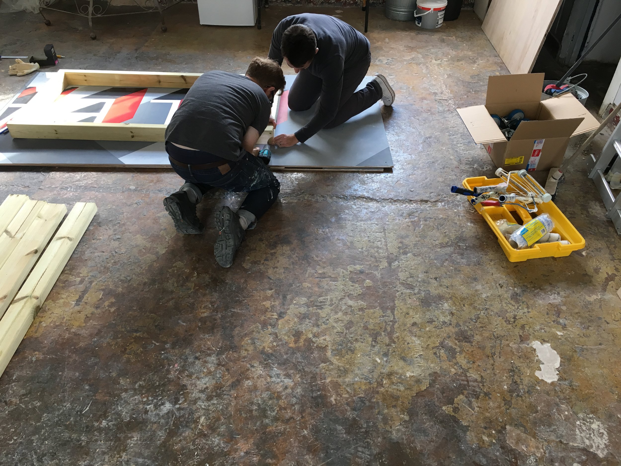
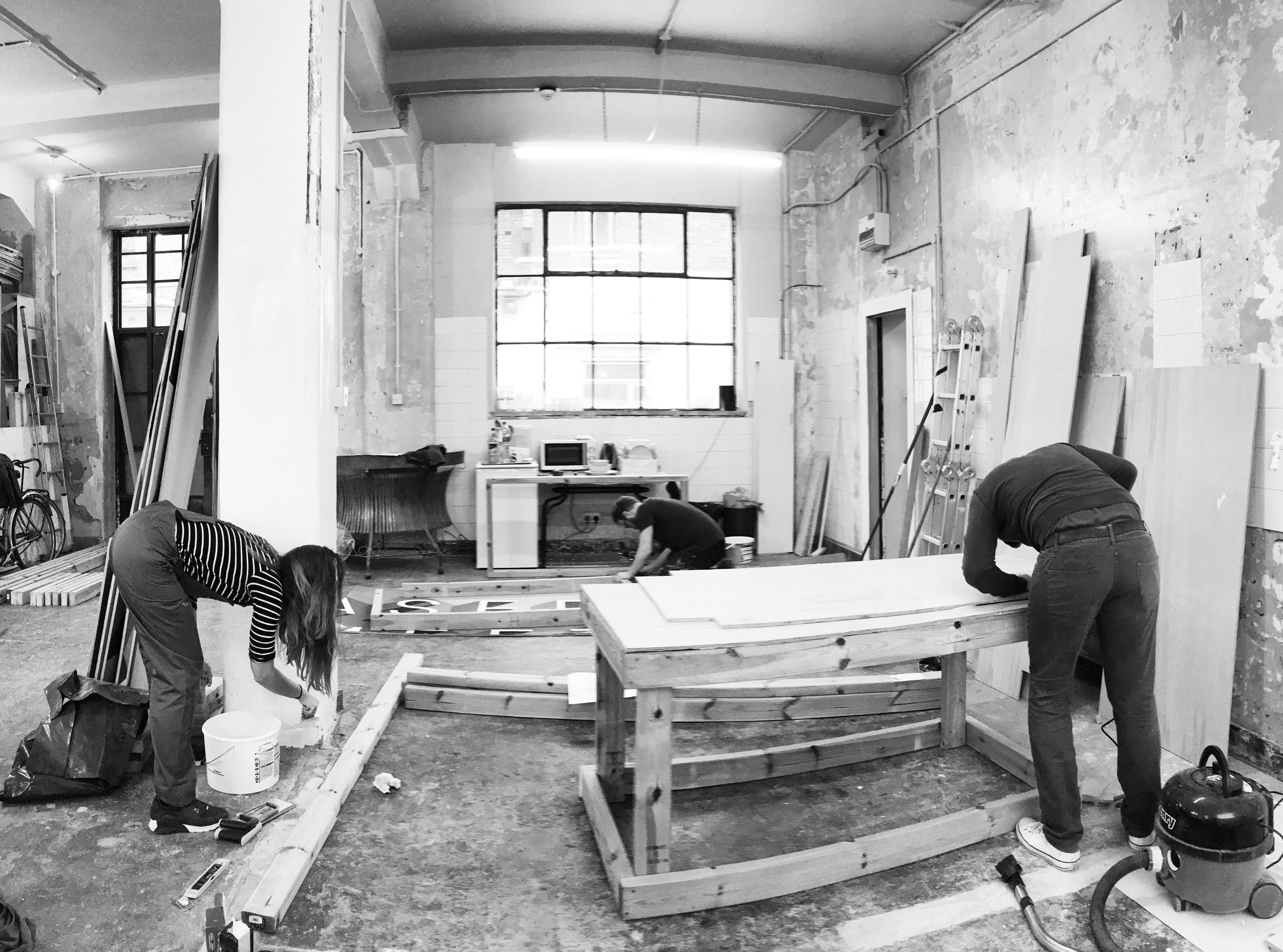
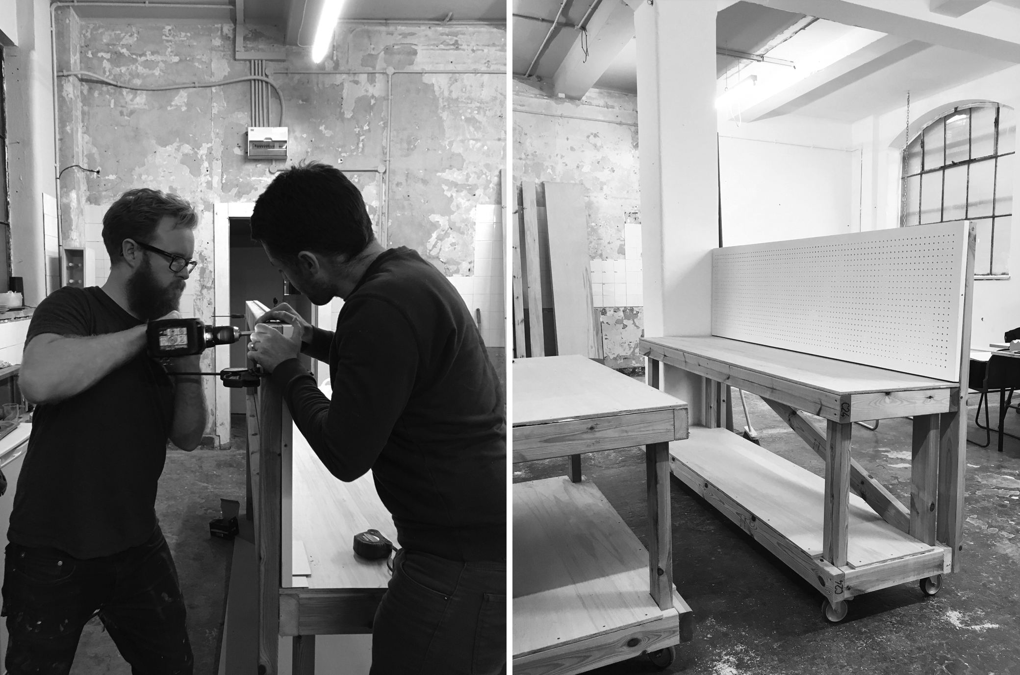
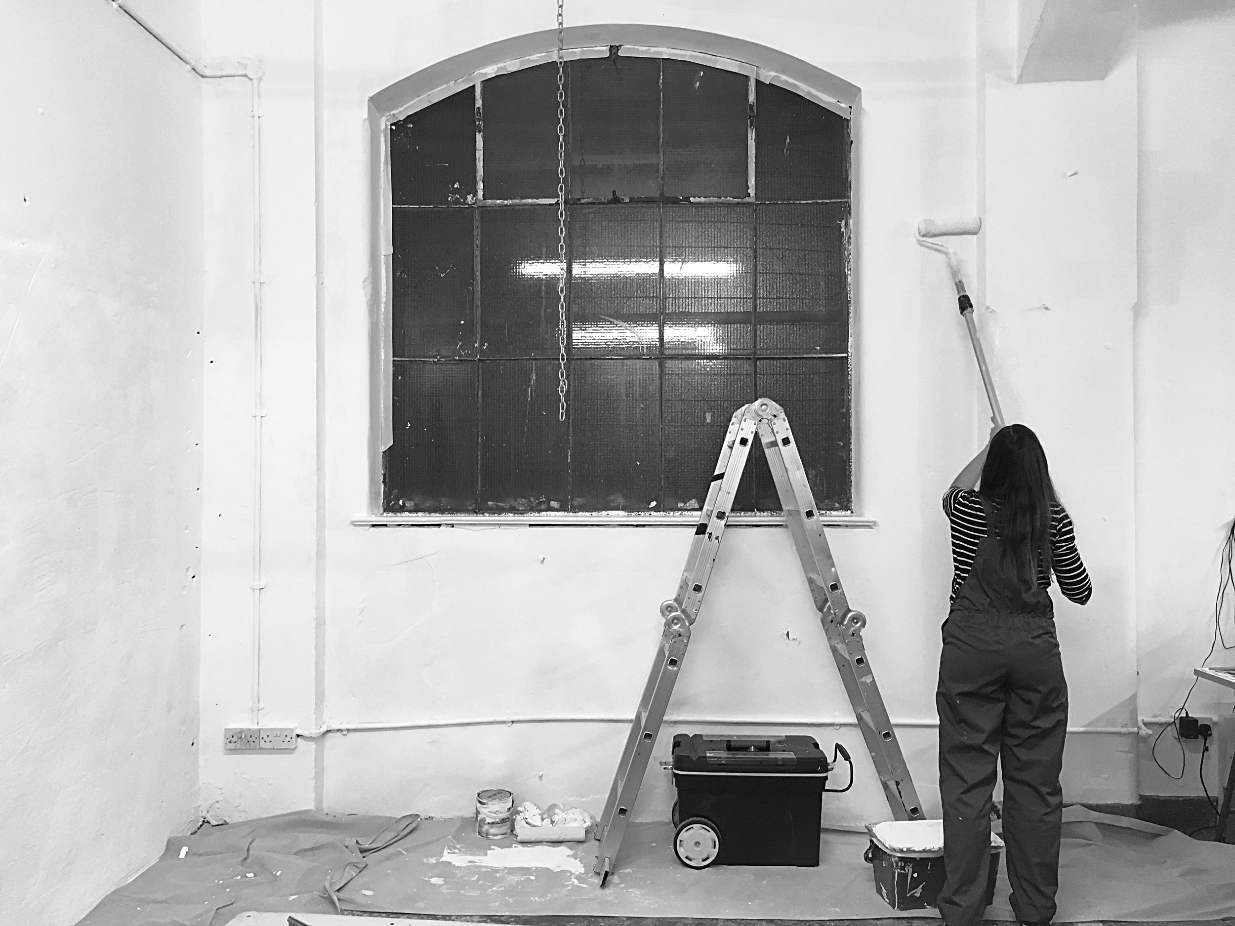
To keep costs at a minimum, we took on most of the DIY work. It took a lot of hard graft and late nights to bring to life the ideal studio environment; from knocking down partition walls to constructing work units (i.e. the kitchen and workshop benches) as well as sourcing and installing cost effective materials, furniture and fittings to create the nearest desired aesthetics.

The image gallery above gives you a glimpse of all the work that took place behind-the-scenes and what you see below is the result of three months of hard core DIY! It's still work in progress but what's been achieved so far has, without a doubt, made a massive improvement to the space. There's more natural light flooding in for a start, making it feel more spacious and uncluttered. Work and communal areas are now clearly defined and functional, to accommodate all our work styles and needs as designer-makers. And what I love the most about it, is that despite all the alterations, the industrial features of the unit have not been compromised. In fact, I feel it's enhanced the space further by bringing a more harmoinius balance between the old and the new. 
What do you think?

studio vibes

IMAGE CREDIT : Molu Designs

[All rights reserved ©MoluDesigns]